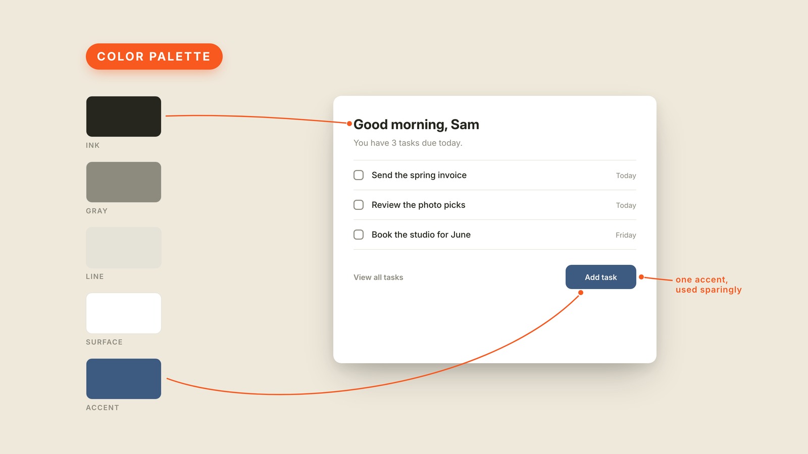
Fig. 49 / Color Palette
Visual Design Vocabulary
Color Palette
EXPLAINED SIMPLY:A color palette is the small set of colors a product commits to, chosen once and reused everywhere, so every screen looks related instead of random.
A color palette is the small set of colors a product commits to, chosen once and reused everywhere, so every screen looks related instead of random. It's a real list you can point at, and it's usually shorter than people expect.
The picture shows a whole app running on five swatches: a near-black ink for headlines, a gray for supporting text, a faint line color for dividers, a white surface, and one blue accent. Five decisions, made once. Every piece of the task card, from the greeting down to the button, traces back to that short row on the left.
What surprises most people is how little color a color palette contains. The bulk of it is neutrals doing quiet structural work, and the actual color is rationed. In the picture, the blue appears exactly once, on the button the screen most wants you to press. An accent color is loud precisely because it's rare. That's why the strongest color in a palette usually lands on the call to action and almost nowhere else.
Committing to a palette also kills a hundred small debates. Nobody re-picks the button color per screen, and new features arrive already looking like they belong. When a product feels like a group project, mismatched colors are usually the first tell. The cure is a shorter list that everyone sticks to.
You'll also hear color scheme, brand colors, and color system, which usually means the palette plus the rules for using it. Dark mode, done properly, is this same list designed a second time for dark backgrounds. If the screens are drifting apart visually, don't ask for nicer colors, ask to see the palette. If nobody can produce one, that's your answer.