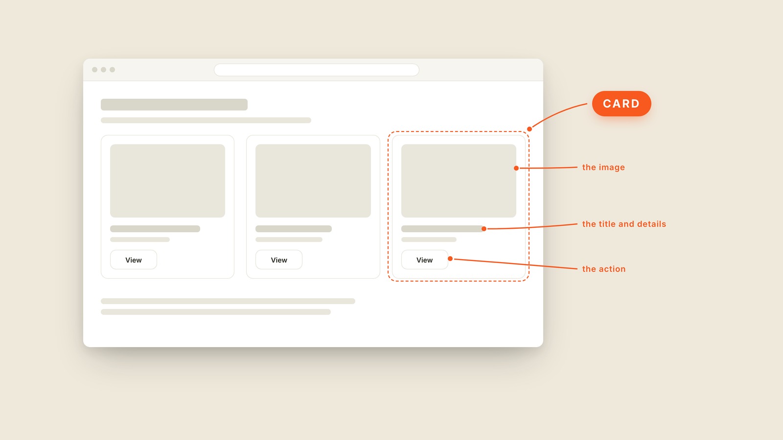
Fig. 26 / Card
Web UI Patterns
Card
EXPLAINED SIMPLY:A card is the rectangular container that groups an image, a title, and a few details into one self-contained, clickable unit, usually repeated in a grid of near-identical siblings.
A card is the rectangular container that groups an image, a title, and a few details into one self-contained, clickable unit, usually repeated in a grid of near-identical siblings.
The picture shows the anatomy: the image on top, the title and details under it, one action at the bottom. Repeat that shape across a page and you have most of the modern internet. Airbnb listings are cards. So are YouTube videos, and the recipe site you checked this morning.
Cards won because they travel well. The same card that sits three across on a desktop stacks into a single column on a phone, which is why card layouts and responsive design get along so well.
A card also makes a quiet promise. Everything inside the border belongs together, and tapping anywhere on it should go to one place. The classic mistake is wiring up only the small View button while the rest of the card ignores taps. People tap the picture, nothing happens, and they conclude the site is broken.
You'll also hear "tile," which usually means the squarer, denser cousin, plus "card layout" and "card grid" for the arrangement.
When you have twenty similar things to show, ask for cards. Then ask whether the whole card is clickable, because someone will assume it is.