$ point --at "the popup thing" --name-it
Design terms,
for non‑designers.
The real names for the things you see and tap every day, each with a picture of the actual pattern.
Sibling: nontechnical.dev, the same idea for tech terms.
Illustrated
Every term gets its own picture. Tap any plate to read it, explained simply.
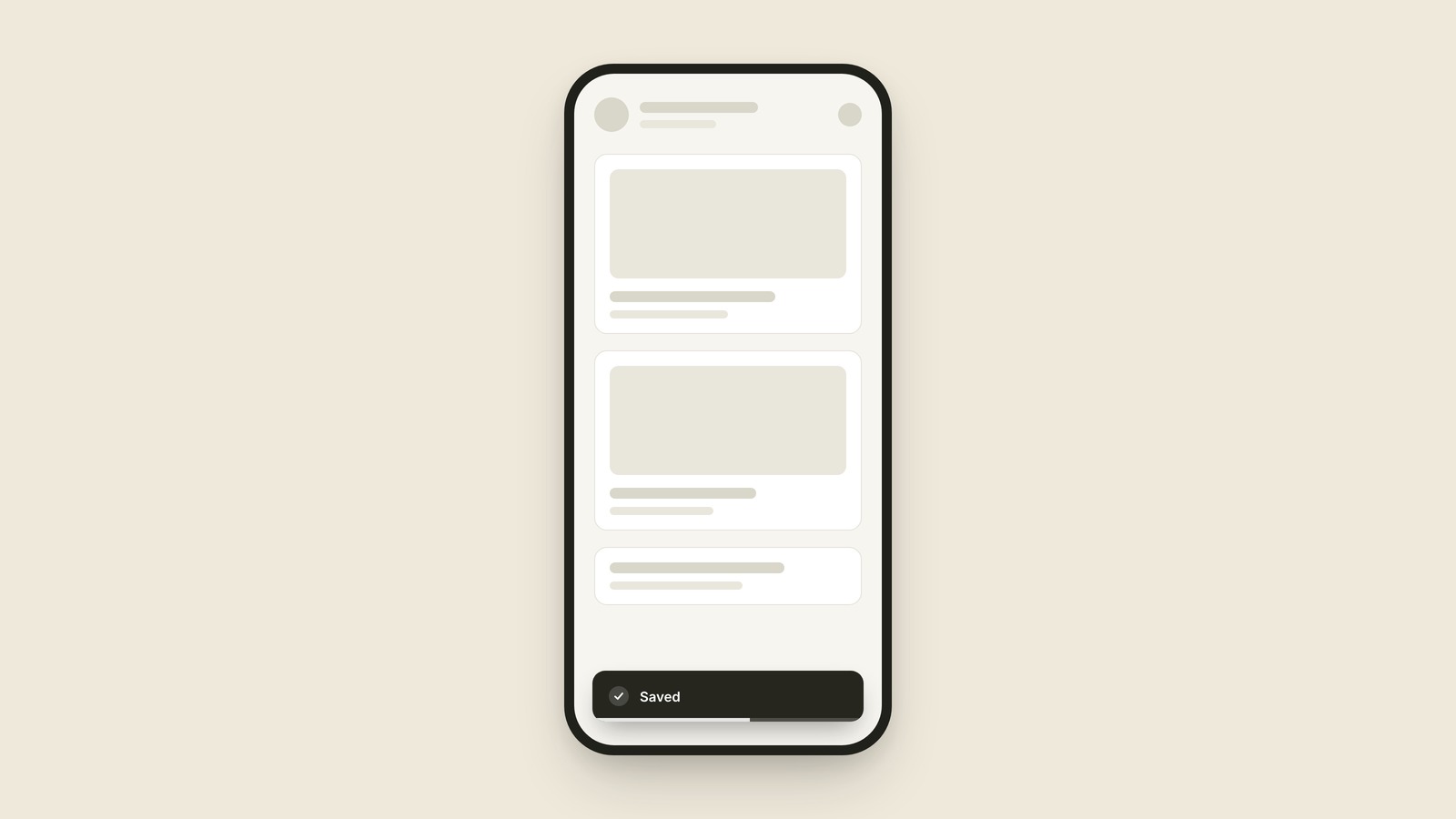
Toast
A toast is the small message that appears briefly on screen to confirm something happened, then disappears on its own without you touching anything.
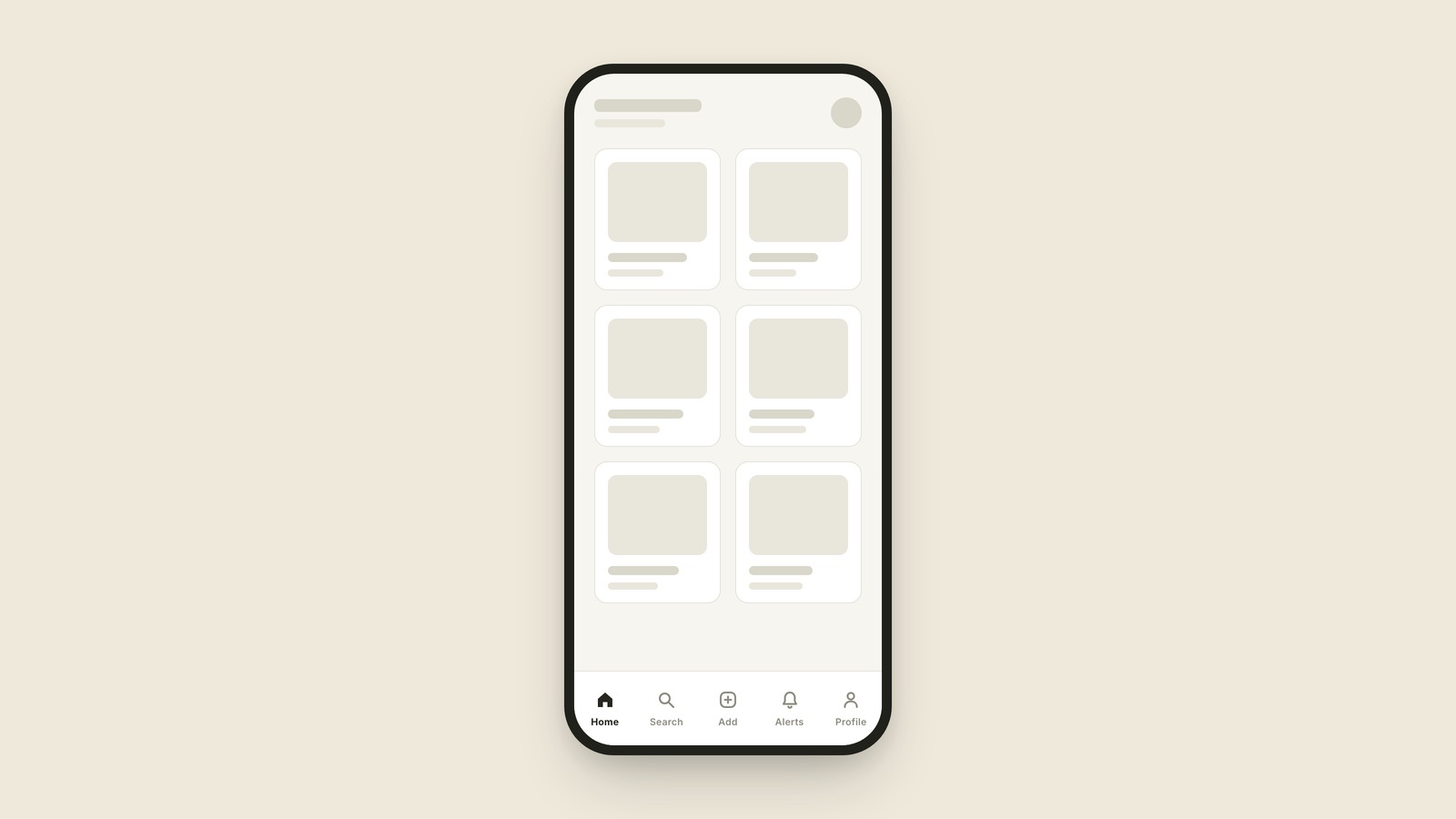
Tab Bar
A tab bar is the row of icons along the bottom of an app that switches between its main sections.
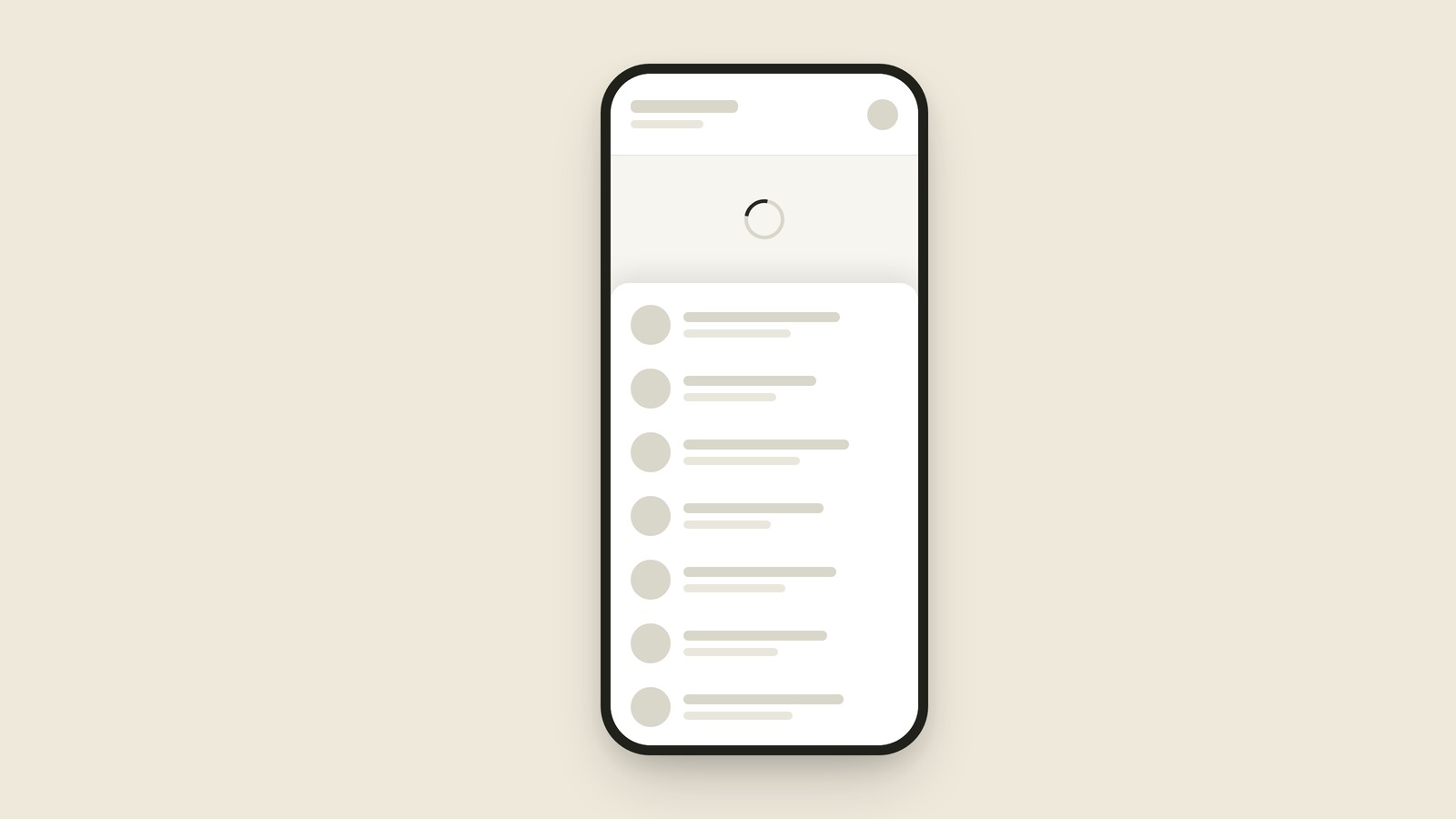
Pull to Refresh
Pull to refresh is the gesture where you drag a list downward past its top and let go to reload it.
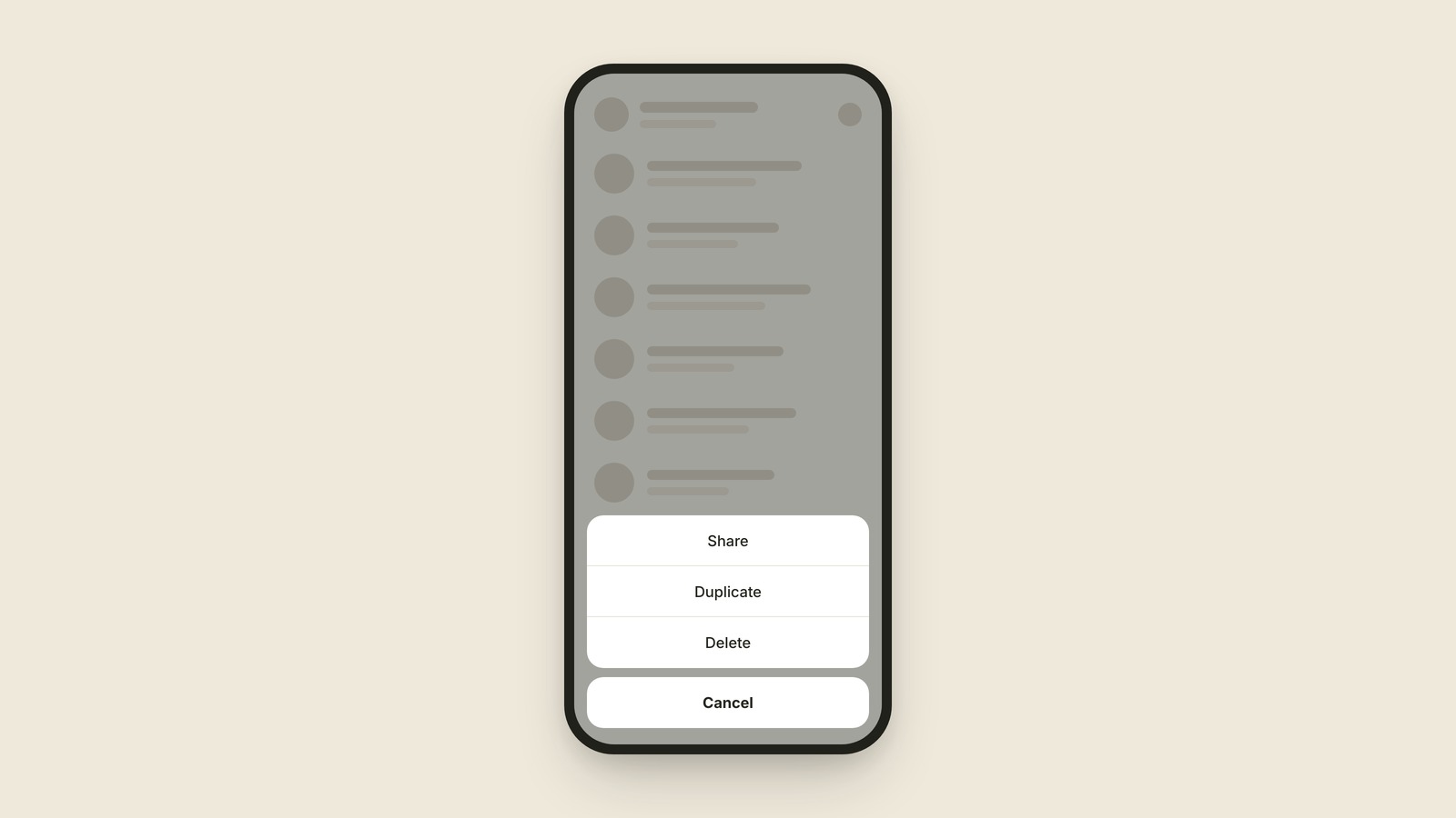
Action Sheet
An action sheet is the menu that slides up from the bottom of the screen listing the things you can do to whatever you just tapped: Share, Duplicate, Delete.
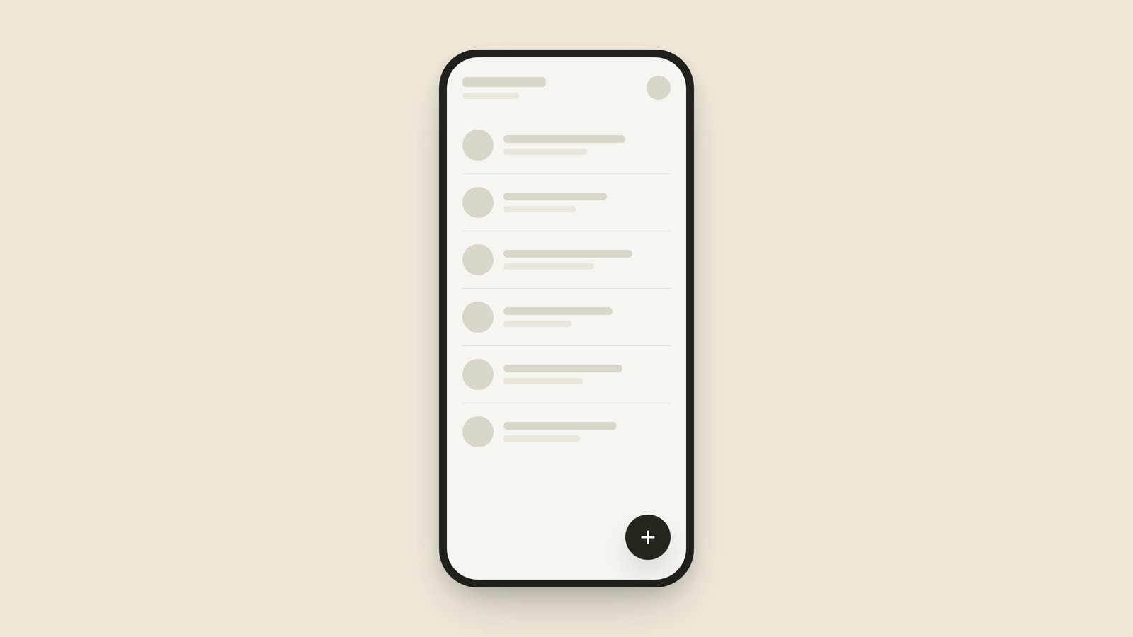
Floating Action Button
A floating action button is the round button hovering in the bottom corner of an app screen, sitting on top of everything, that does the screen's single most important thing.
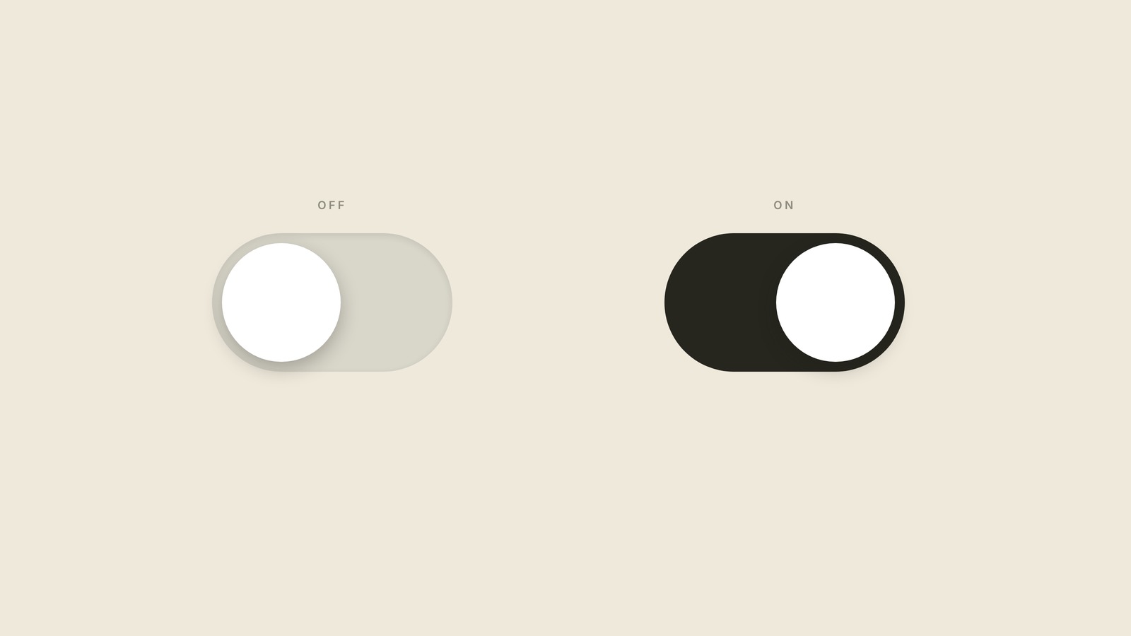
Toggle
A toggle is the little switch that flips a setting on or off the moment you tap it, and it never asks you to save.
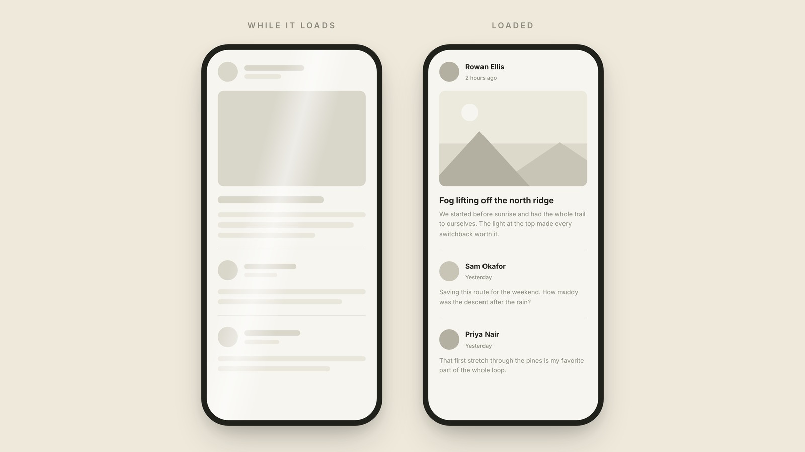
Skeleton Screen
A skeleton screen is the set of gray placeholder shapes an app shows in the exact layout of the real content while it loads.
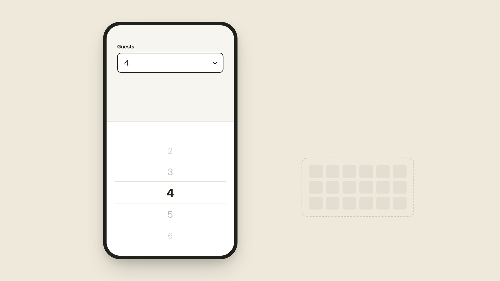
Picker
The rolling wheel that replaces the keyboard.
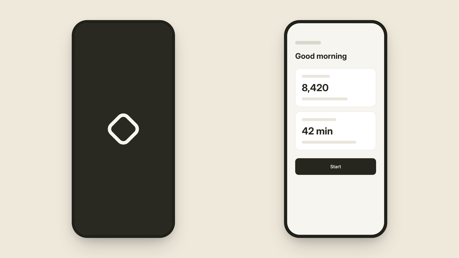
Splash Screen
The brief logo moment before the app is ready.
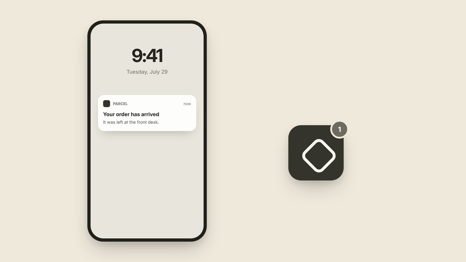
Push Notification
The message an app sends when you are not in it.
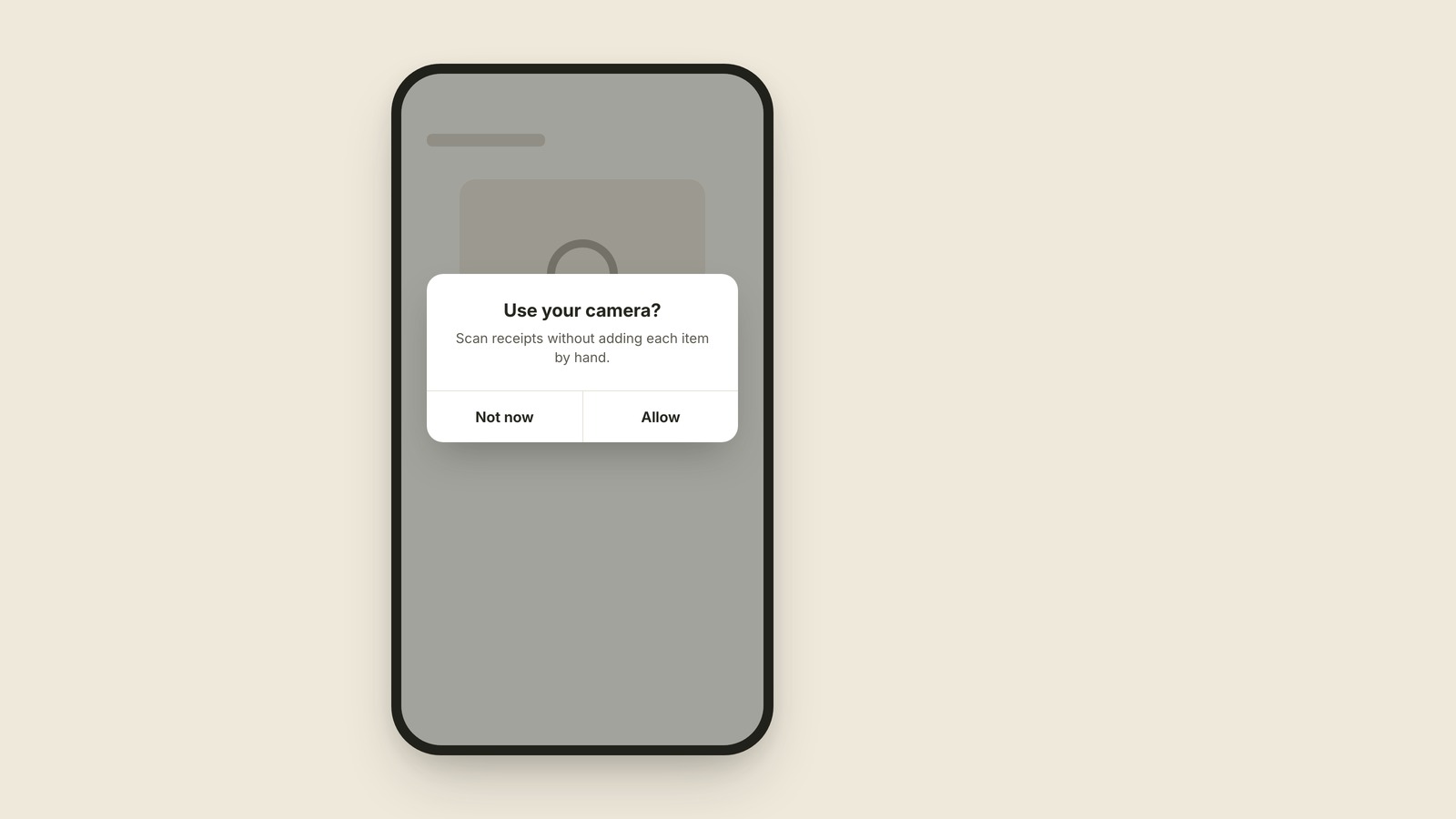
Permission Prompt
The system-owned box asking for private access.
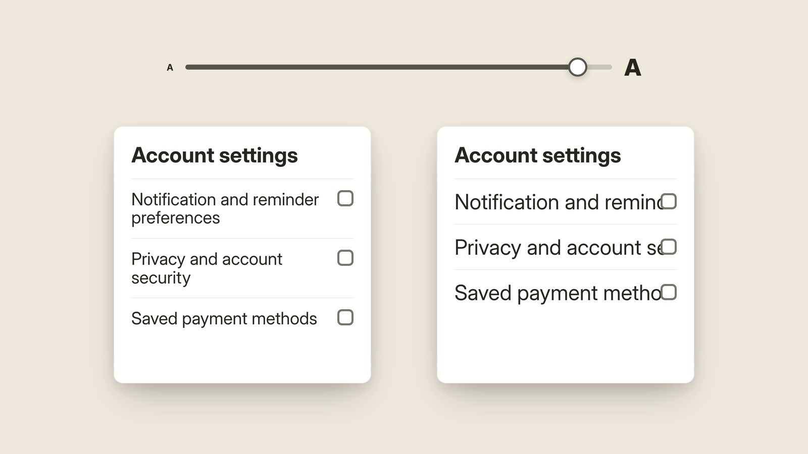
Text Scaling
What happens when the reader turns the words up.
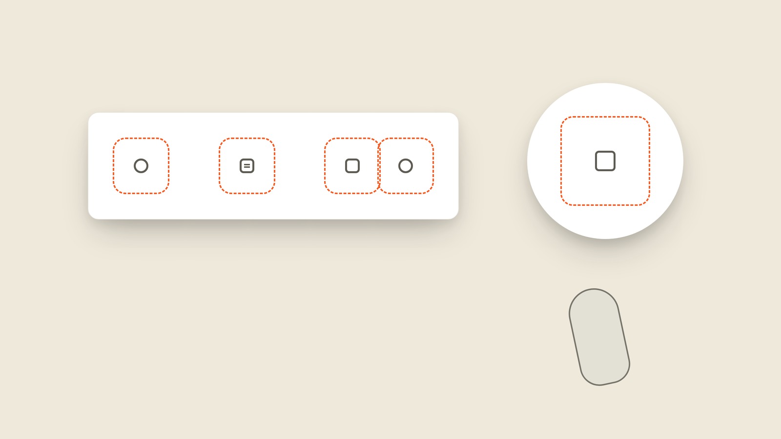
Tap Target
The full finger-sized area behind a control.
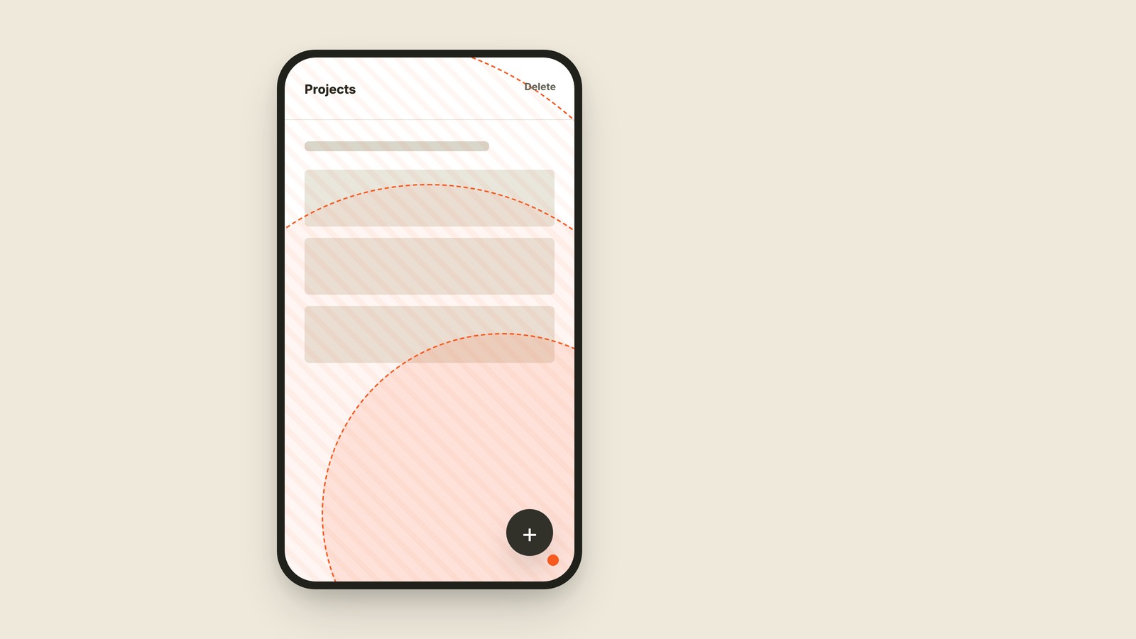
Thumb Zone
The part of a phone one hand can reach comfortably.
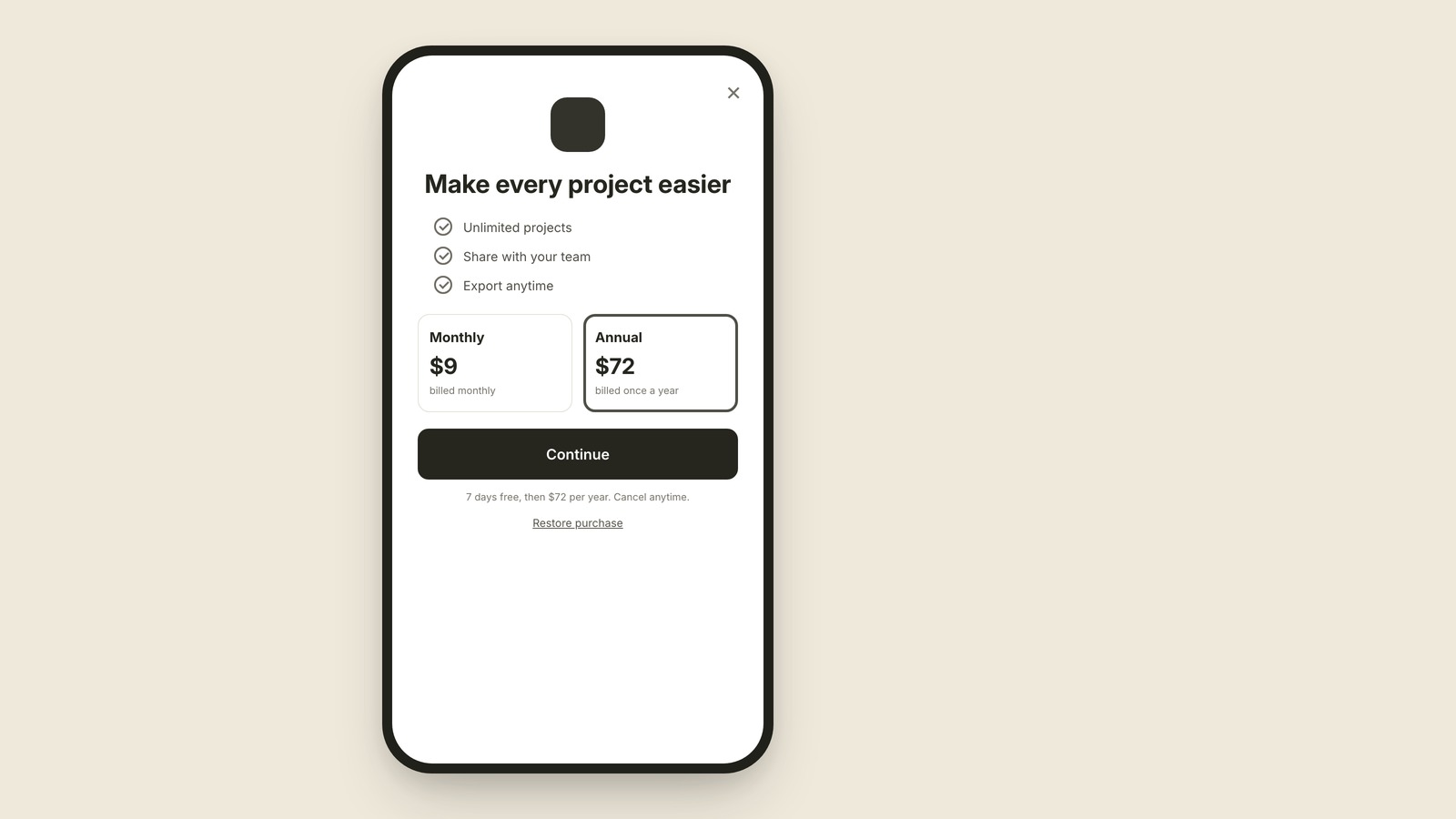
Paywall
The screen explaining what paid access costs.
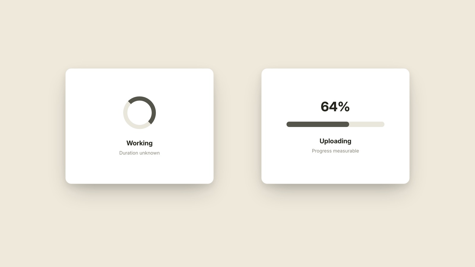
Spinner & Progress Bar
Two loading signals for two kinds of wait.
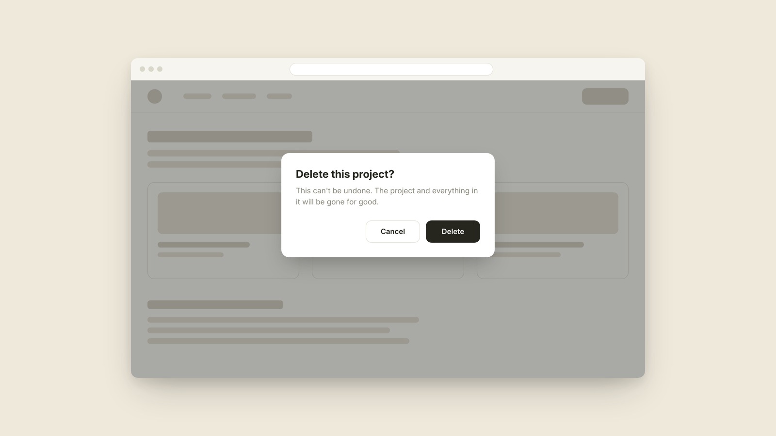
Modal
The box that stops everything until you deal with it.
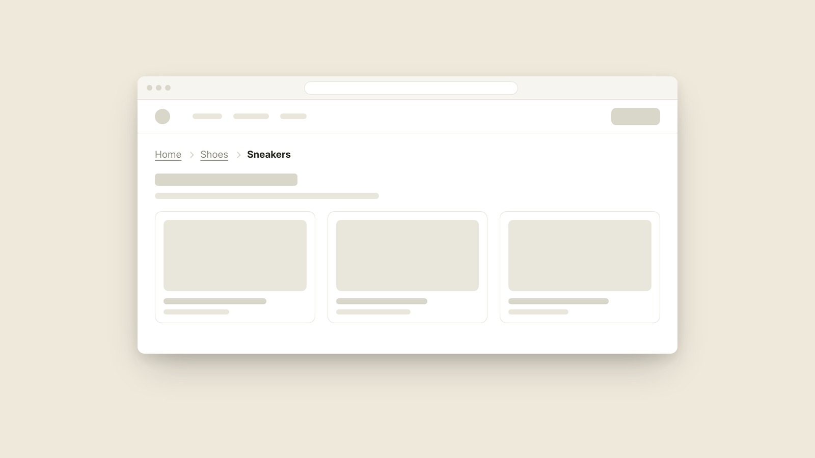
Breadcrumb
A breadcrumb is the trail of links near the top of a page that shows where you are in a site, like Home, then Shoes, then Sneakers.
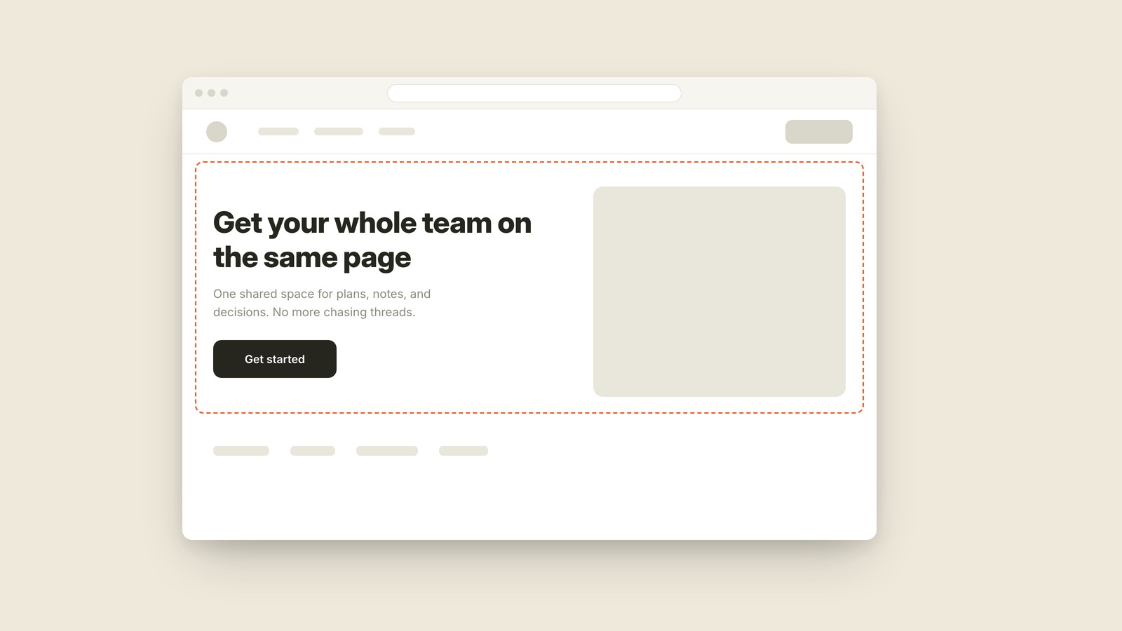
Hero
The hero is the big section at the top of a page that carries the headline, the main image, and the one button the page most wants you to press.
Hamburger Menu
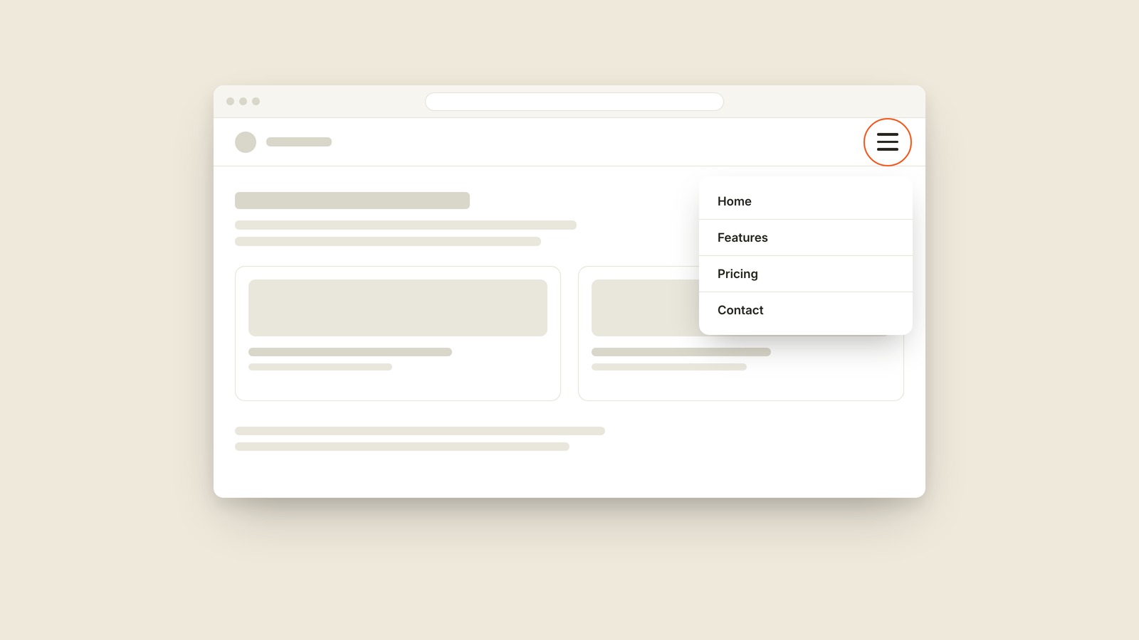
A hamburger menu is the icon made of three stacked lines, usually in a top corner, that opens the navigation a site is hiding.
Sticky Header
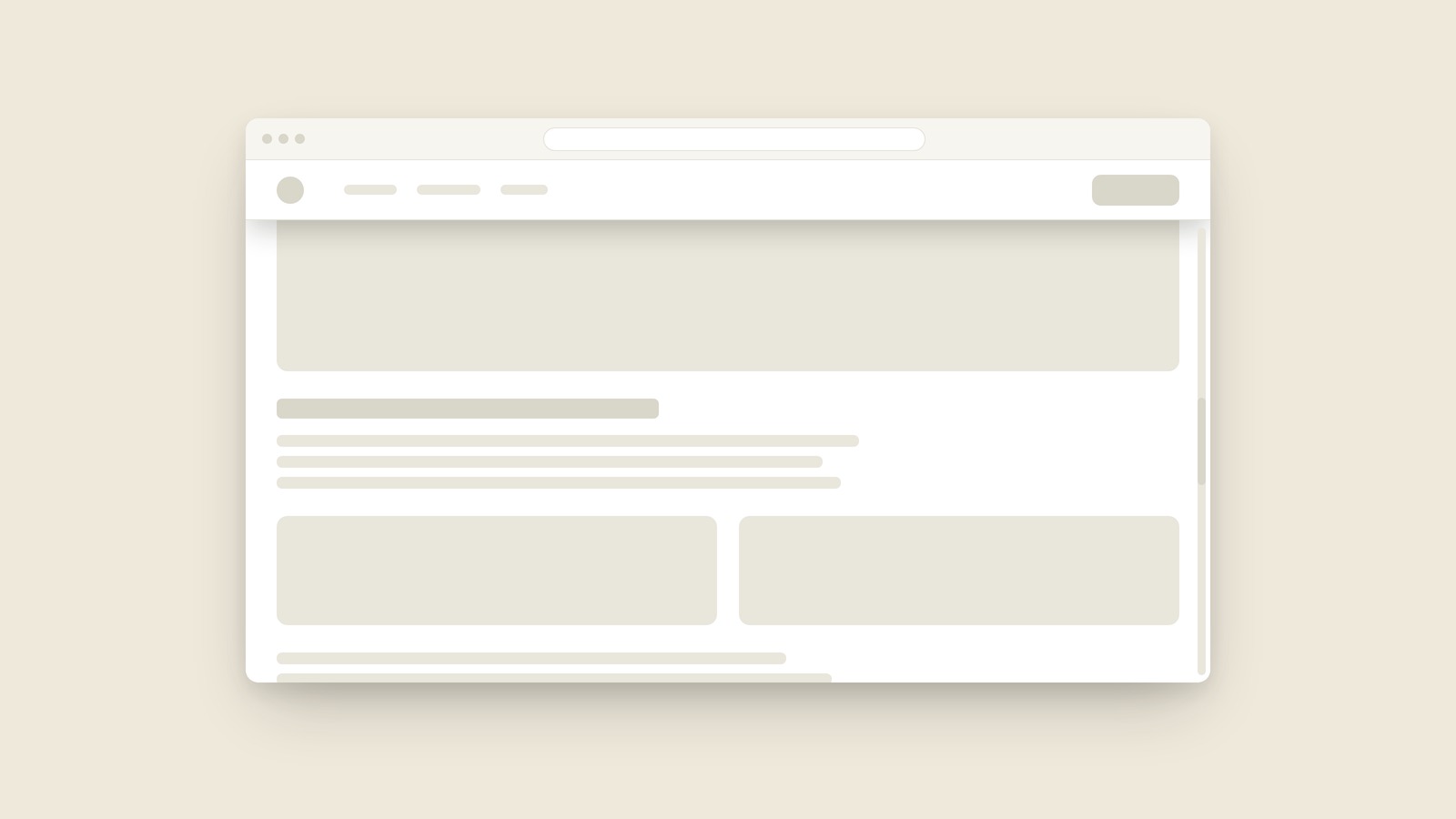
A sticky header is the bar across the top of a site that stays pinned in place while the rest of the page scrolls underneath it.
Dropdown
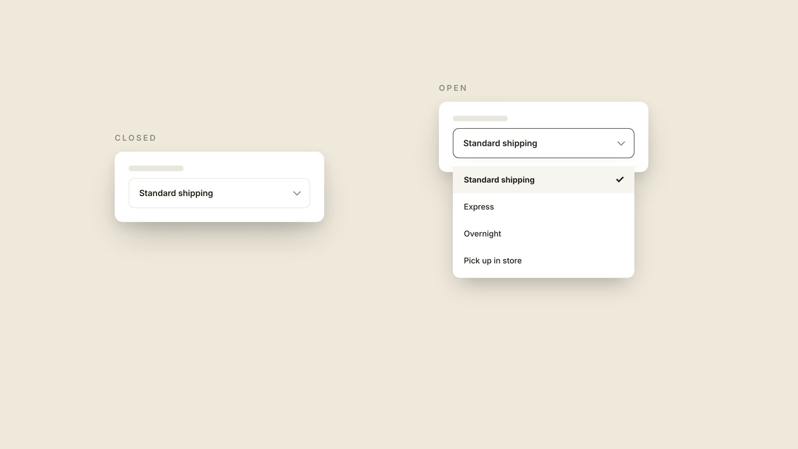
A dropdown is the control that shows only your current choice until you click it, then opens the list of other options.
Accordion
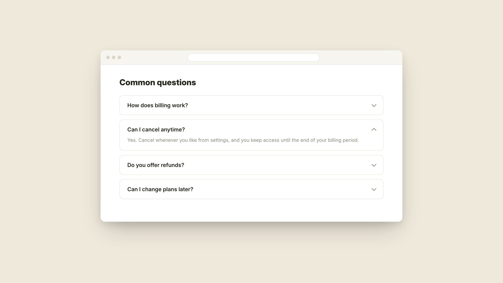
An accordion is a stack of collapsed sections that expand when you click them, most familiar as an FAQ where each answer unfolds beneath its question.
Tooltip
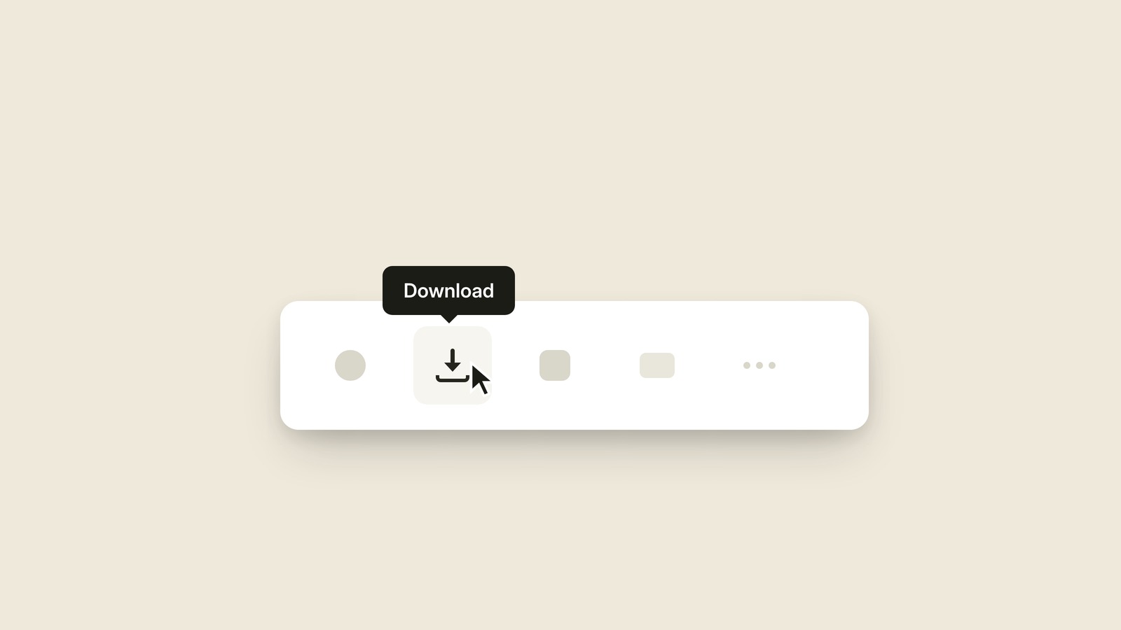
A tooltip is the tiny label that appears when you rest your cursor on something, tells you what it is, and disappears the moment you move away.
Card
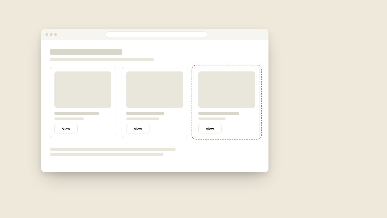
A card is the rectangular container that groups an image, a title, and a few details into one self-contained, clickable unit, usually repeated in a grid of near-identical siblings.
Call to Action (CTA)
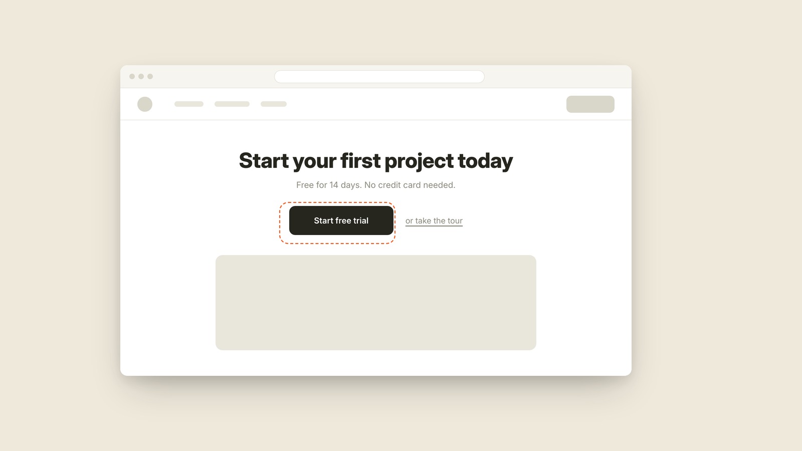
A call to action is the button or link that asks the visitor to take the one next step, like Start free trial or Book a demo.
Above the Fold
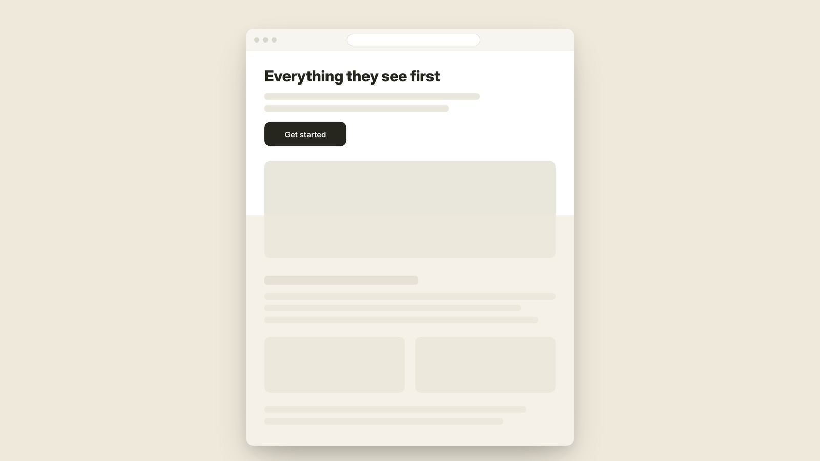
Above the fold is everything visible on a page before anyone scrolls, the only part every single visitor is guaranteed to see.
Responsive Design
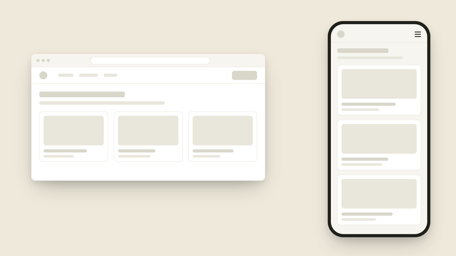
Responsive design means building one site that rearranges itself to fit whatever screen it's on, instead of building separate sites for desktop and phone.
Navigation Bar
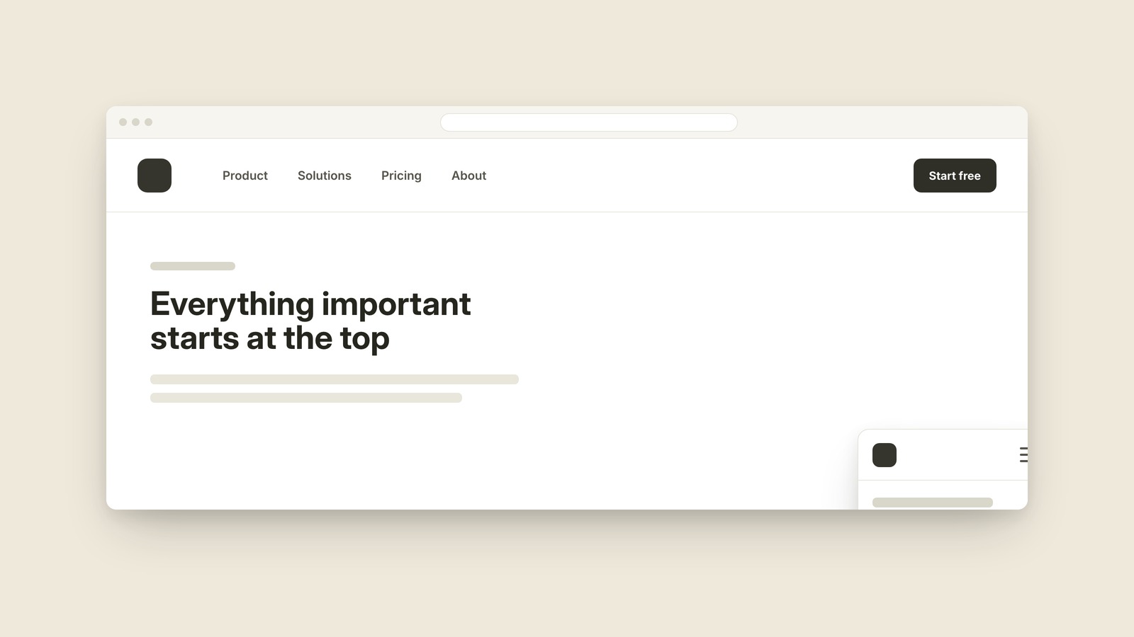
The top row that maps the whole site.
Alt Text
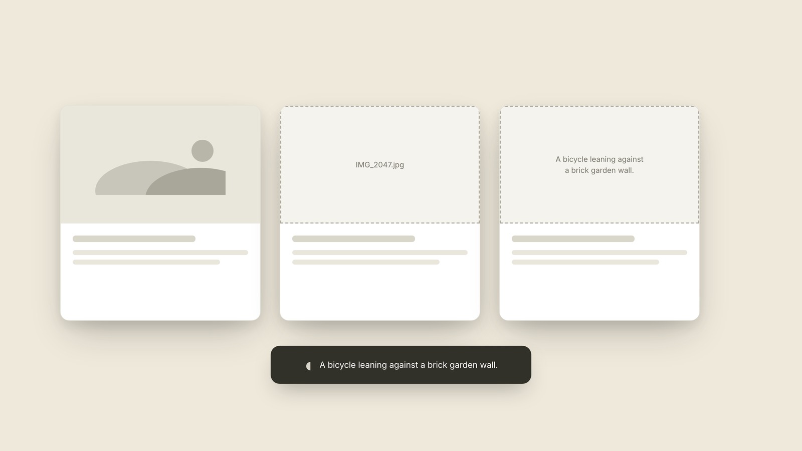
The image description software can read aloud.
Radio Button & Checkbox
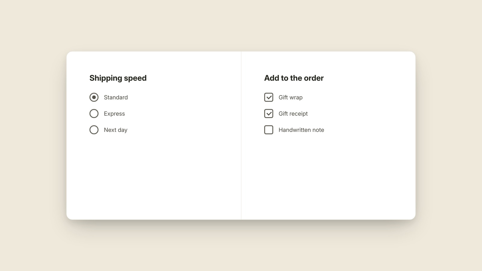
Round for one choice, square for any number.
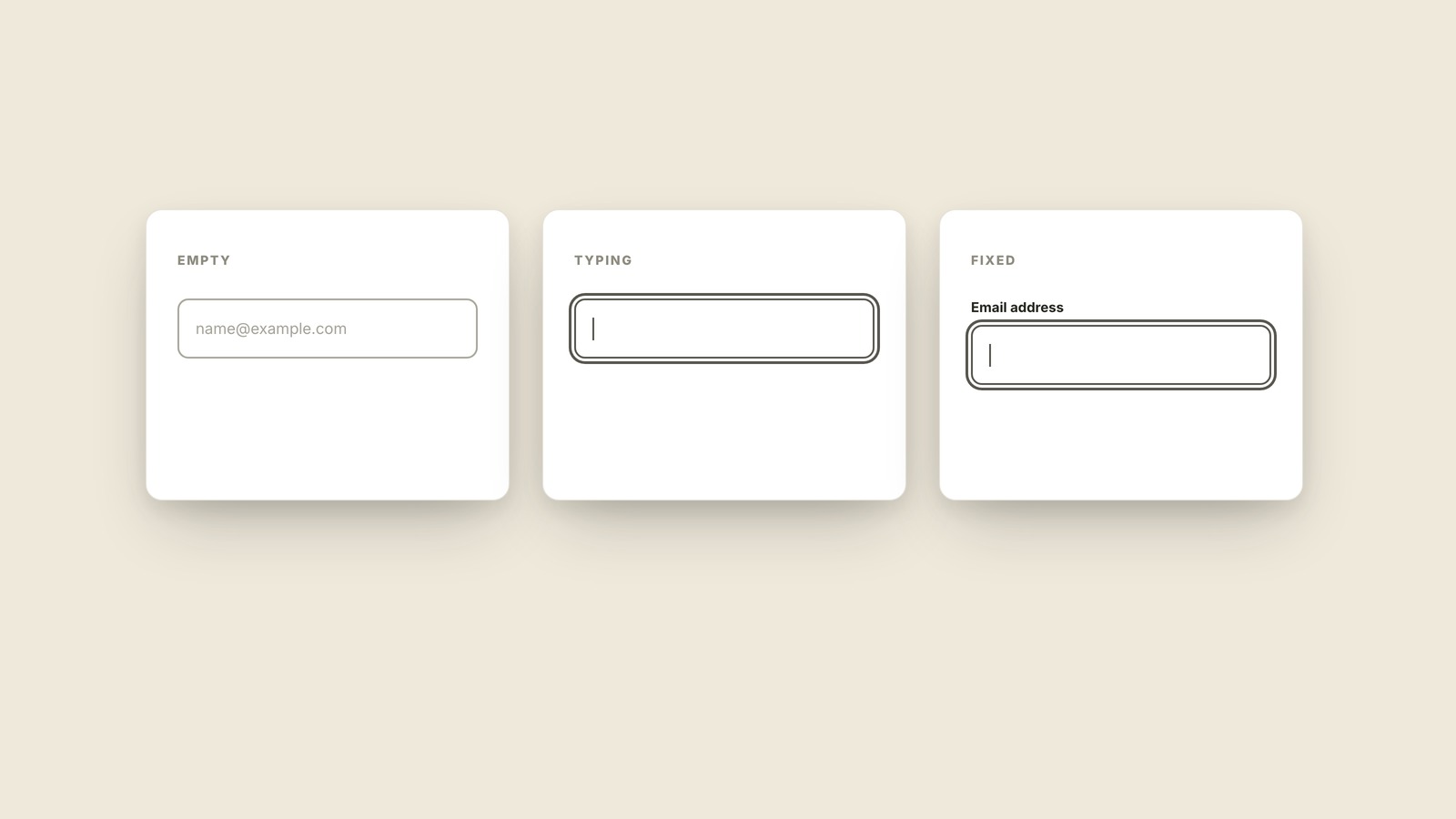
Placeholder Text
The form hint that disappears when typing starts.
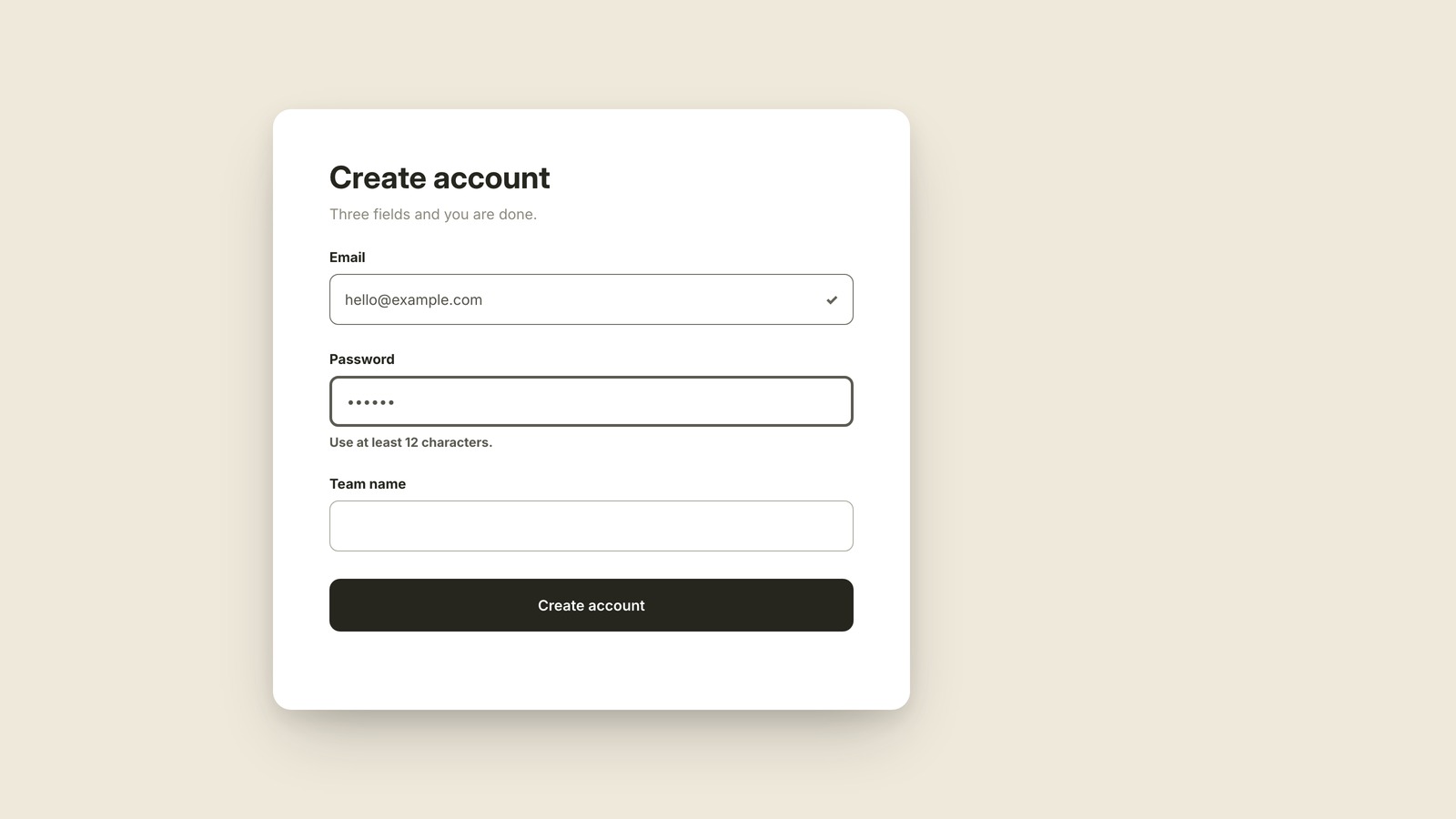
Inline Validation
The form feedback that appears beside the problem.
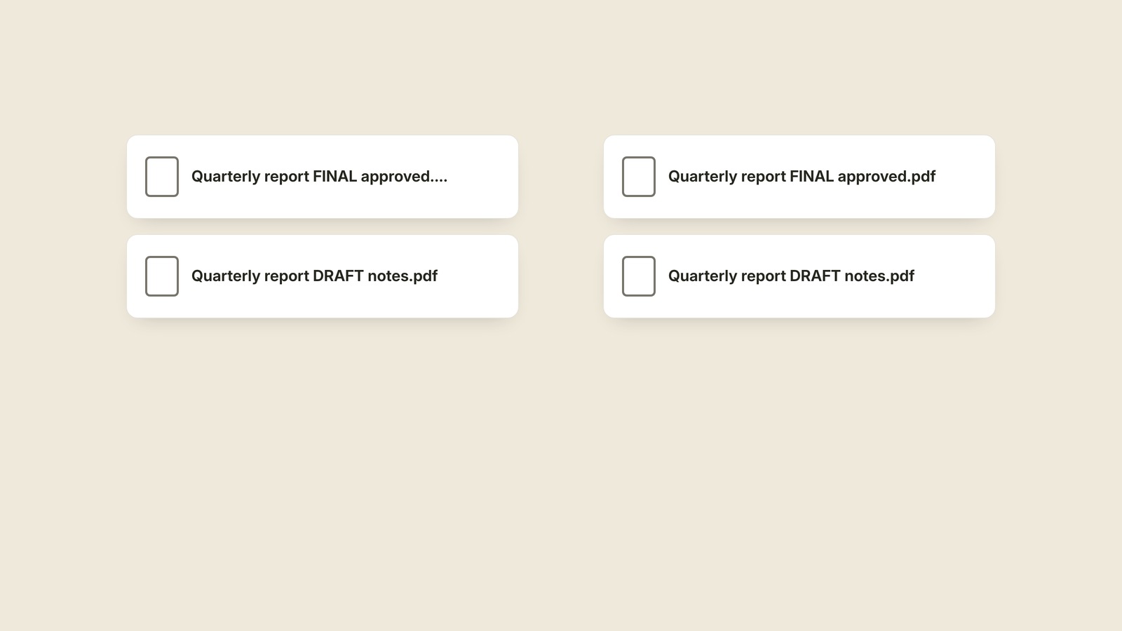
Truncation
The three dots standing in for missing words.
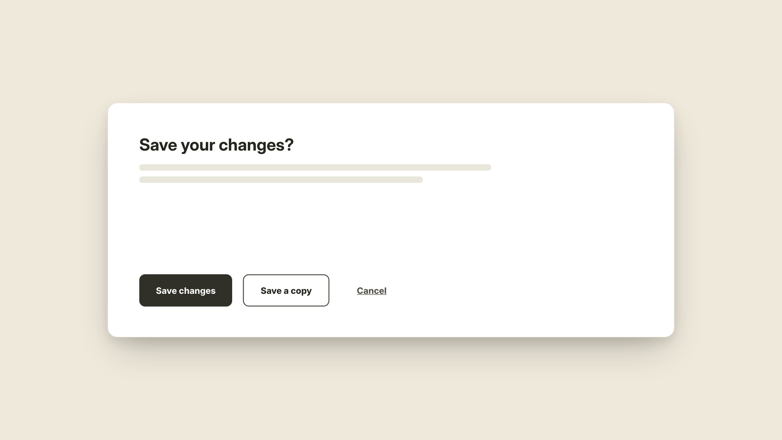
Ghost Button
The outlined action that speaks more quietly.
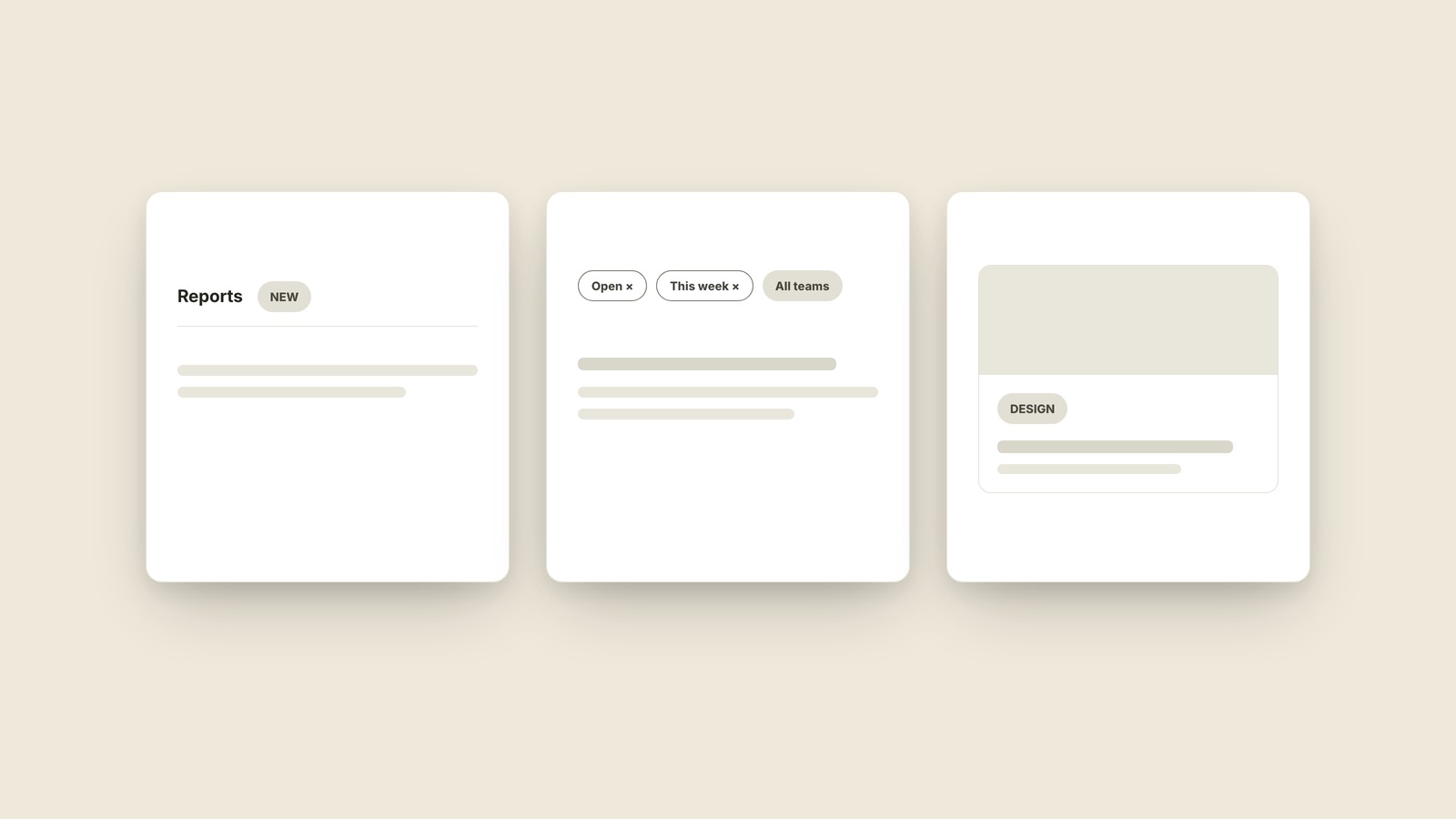
Pill / Chip / Tag
Three names for the same rounded little label.
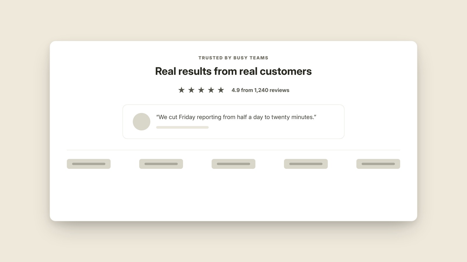
Social Proof
Other people's evidence doing the persuading.
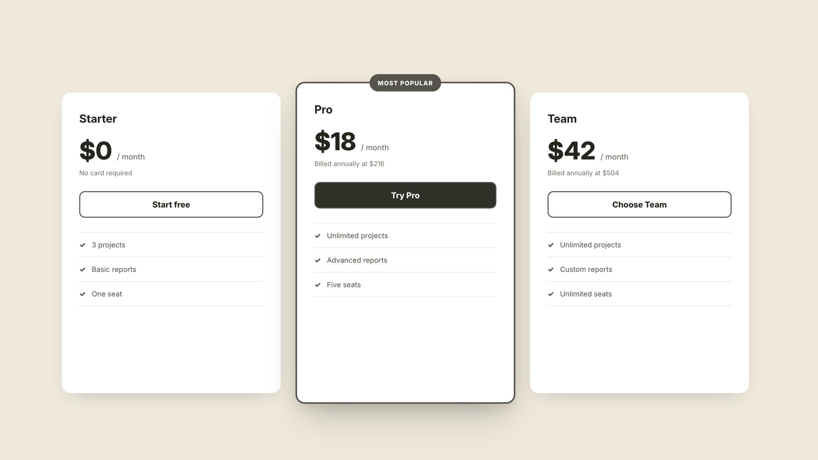
Pricing Table
Plan cards built for side-by-side comparison.
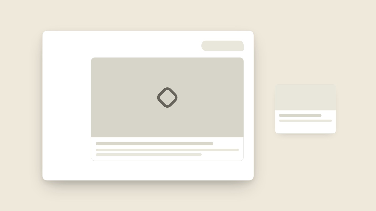
Open Graph Image
The picture a shared link turns into.
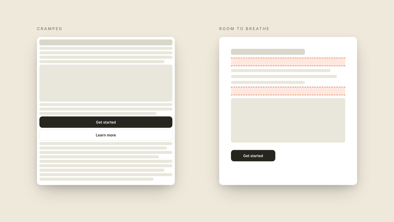
Whitespace
Whitespace is the empty space around and between the elements of a design, left there on purpose so everything has room to breathe.
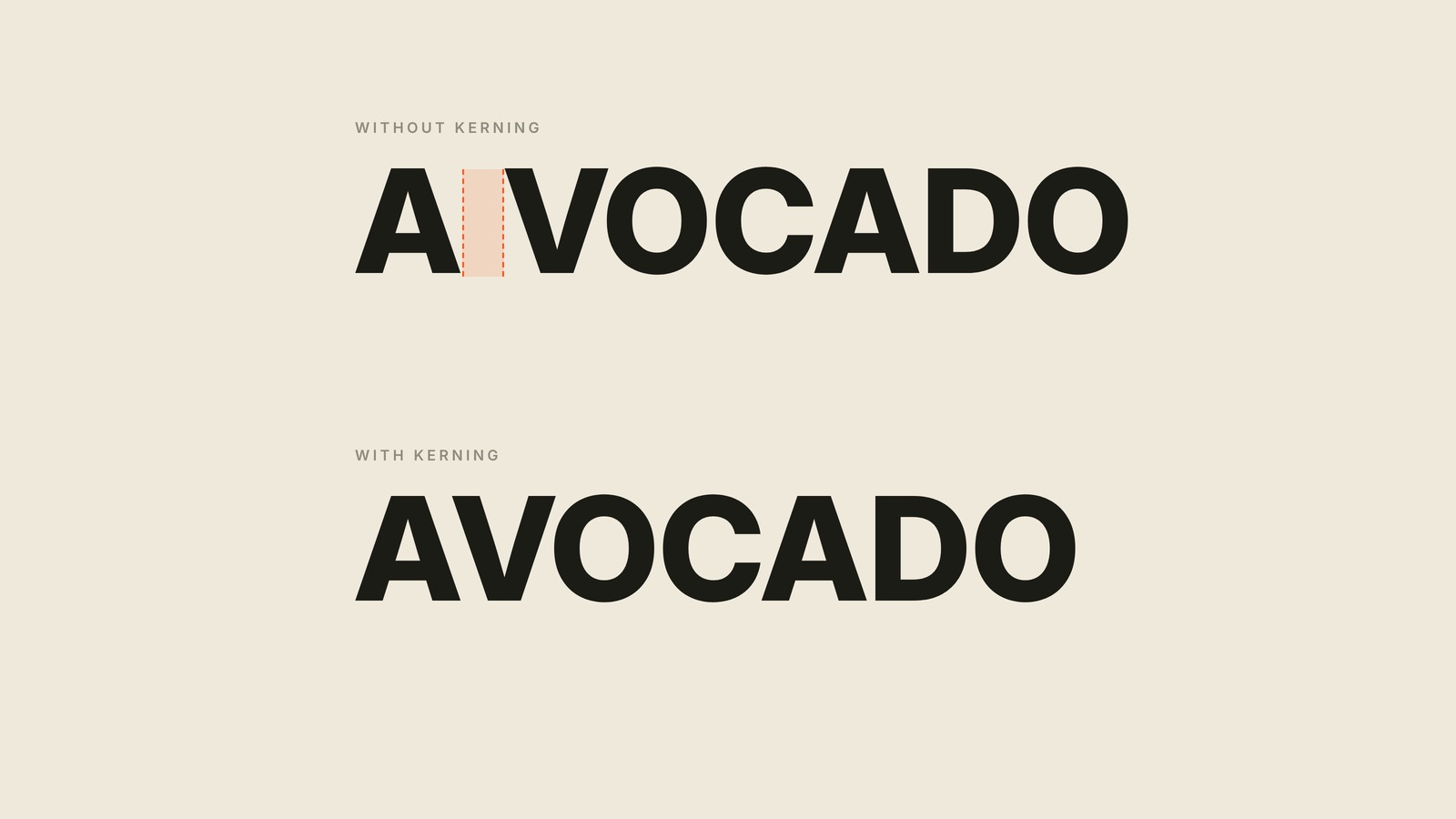
Kerning
The space between two letters, tuned by eye.
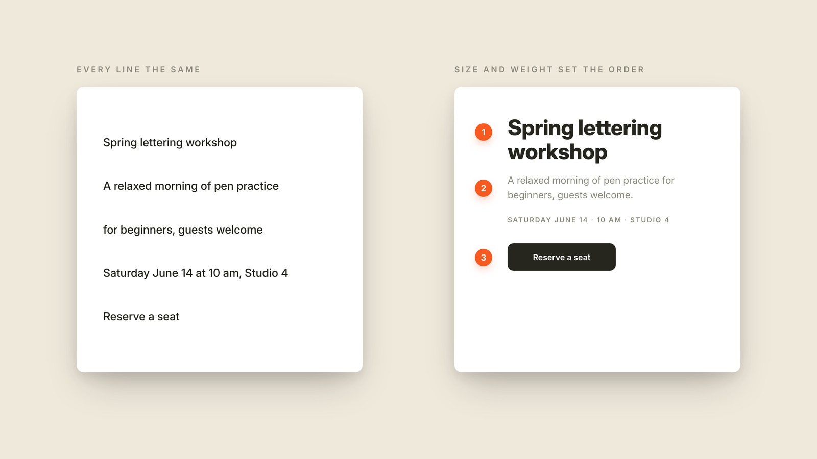
Hierarchy
Hierarchy is making the important things look important, so your eye reads a screen in the order the designer intended.
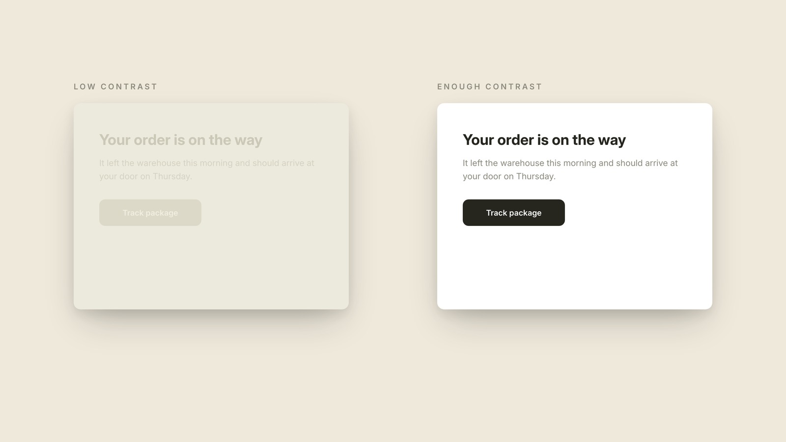
Contrast
Contrast is the difference between an element and whatever sits behind it, and it decides whether text is effortless to read or nearly invisible.
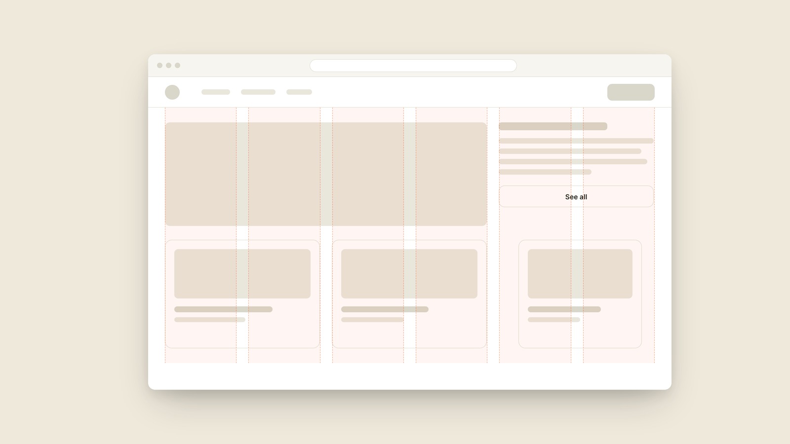
Grid
A grid is the invisible set of columns a layout is built on, so everything lines up on purpose instead of by luck.
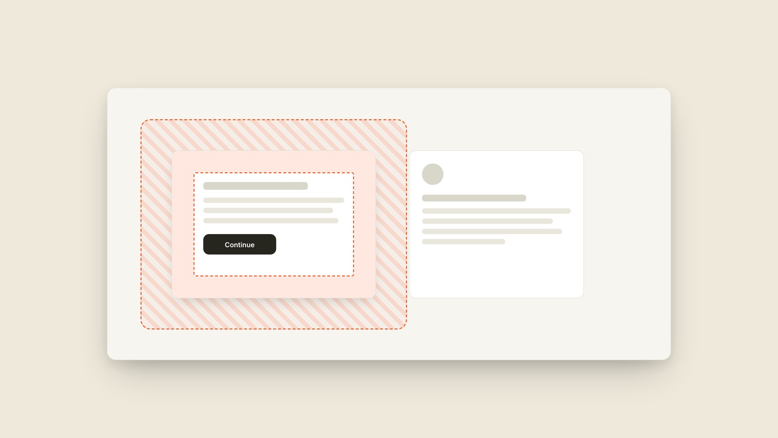
Padding & Margin
Padding is the space inside a box's edge, between the border and the content; margin is the space outside the box, pushing its neighbors away.
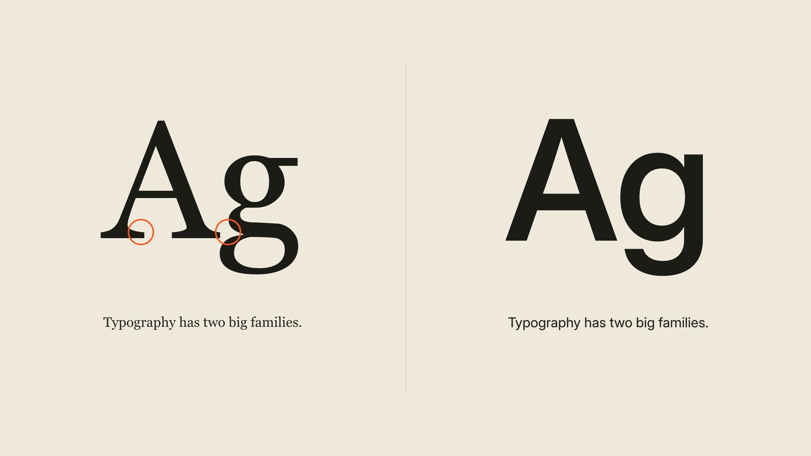
Serif & Sans Serif
Serifs are the small feet at the ends of a letter's strokes: typefaces that have them are serif, and typefaces without them are sans serif, sans being French for without.
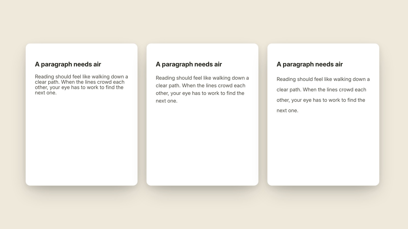
Leading
The vertical space from one line of text to the next.
Color Palette
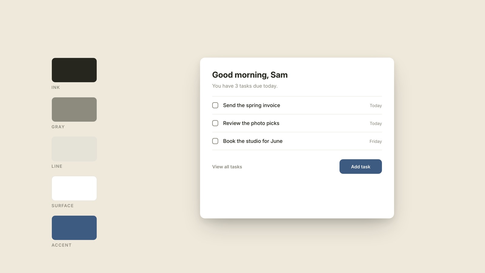
A color palette is the small set of colors a product commits to, chosen once and reused everywhere, so every screen looks related instead of random.
Dark Mode
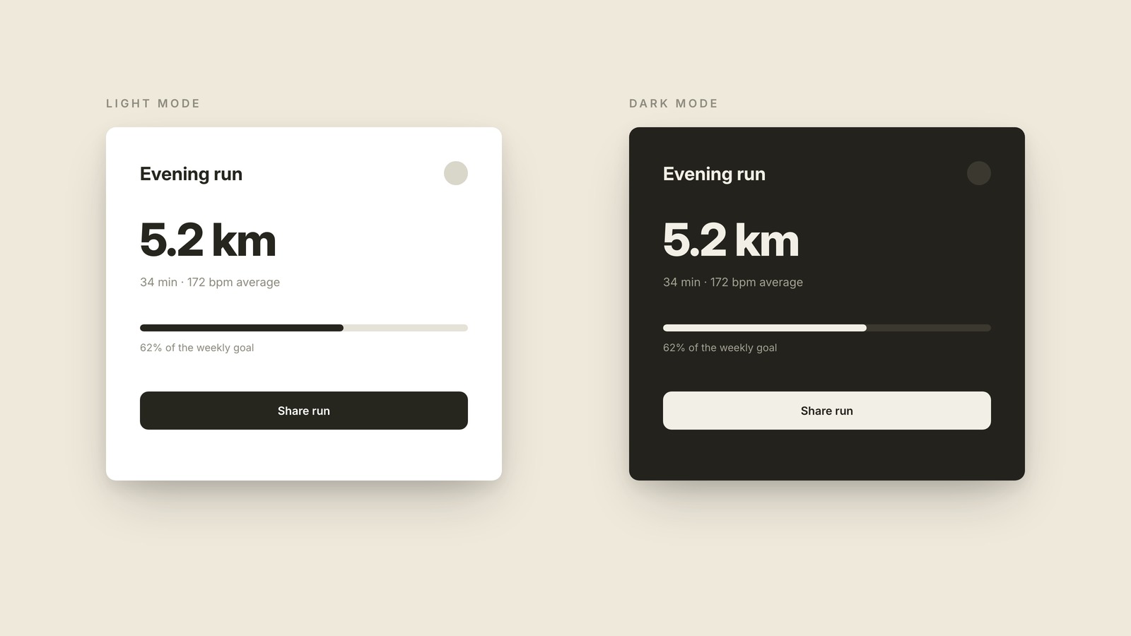
Dark mode is the version of an interface drawn in light text on dark backgrounds, designed as a complete second color scheme rather than the light version with its colors flipped.
Vector & Raster
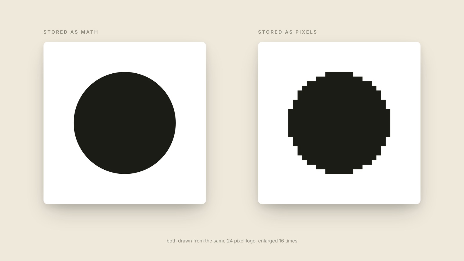
A vector image is stored as math, so it stays perfectly crisp at any size; a raster image is stored as a fixed grid of pixels, so it goes blurry and blocky the moment you enlarge it.
Px vs Em
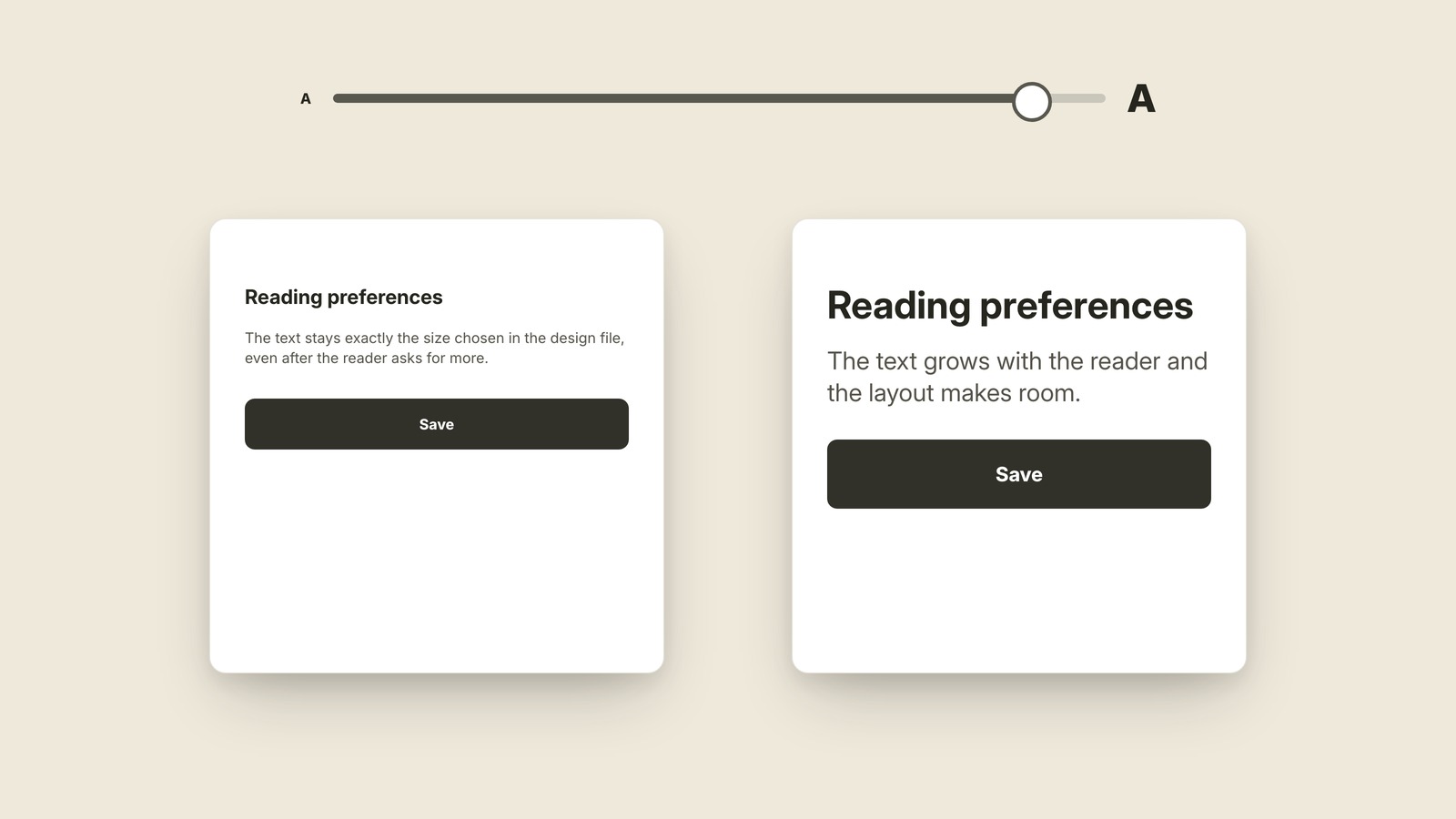
Fixed sizes compared with sizes that can grow.
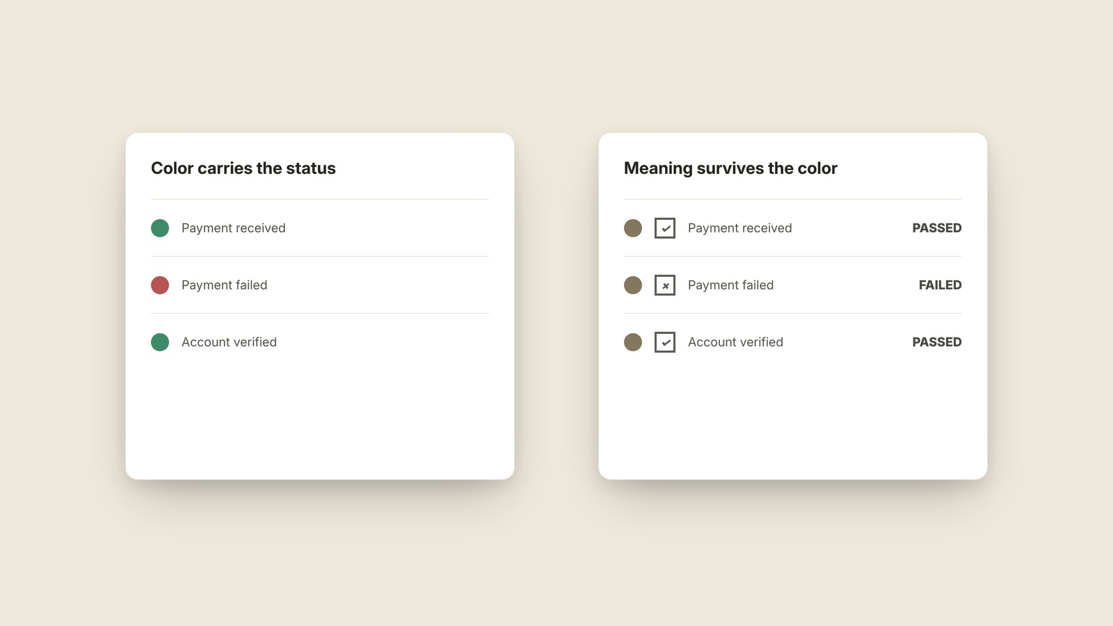
Color Blindness
Why color cannot carry meaning alone.
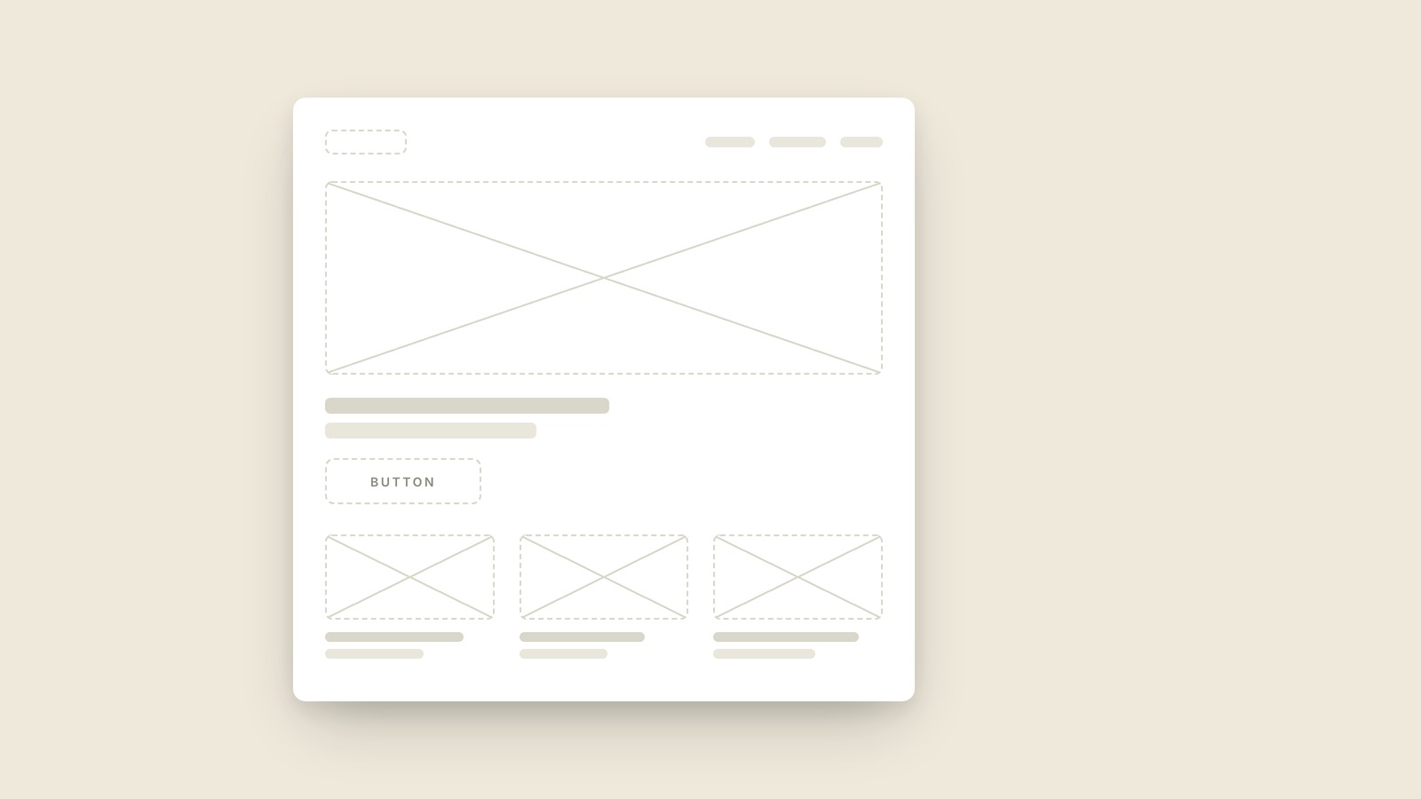
Wireframe
A wireframe is a deliberately rough sketch of a screen, made of gray boxes and placeholder lines, that settles what goes where before anyone argues about colors.
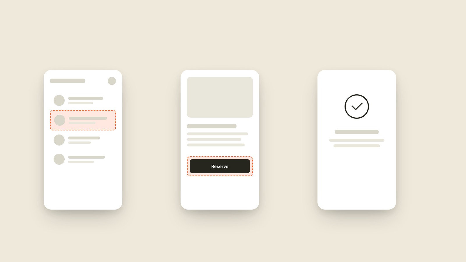
Prototype
A prototype is a clickable fake of a product, real enough to tap through and test, built before the actual product exists.
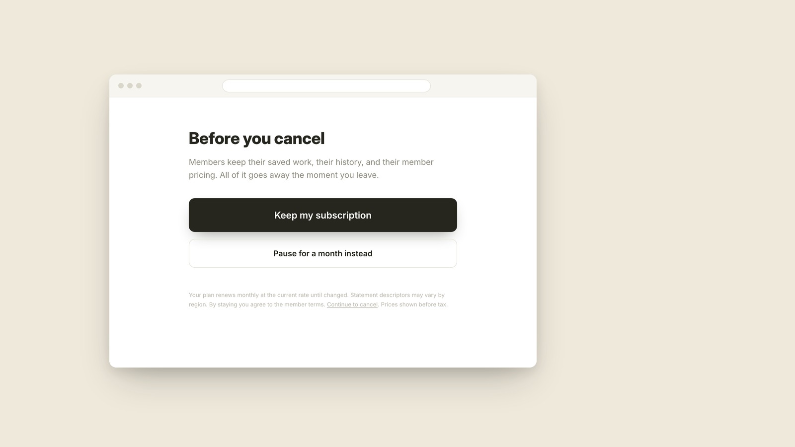
Dark Pattern
A dark pattern is a design trick that steers you into something you didn't mean to choose, like a cancel page where the button to stay is huge and the way out is buried in fine print.
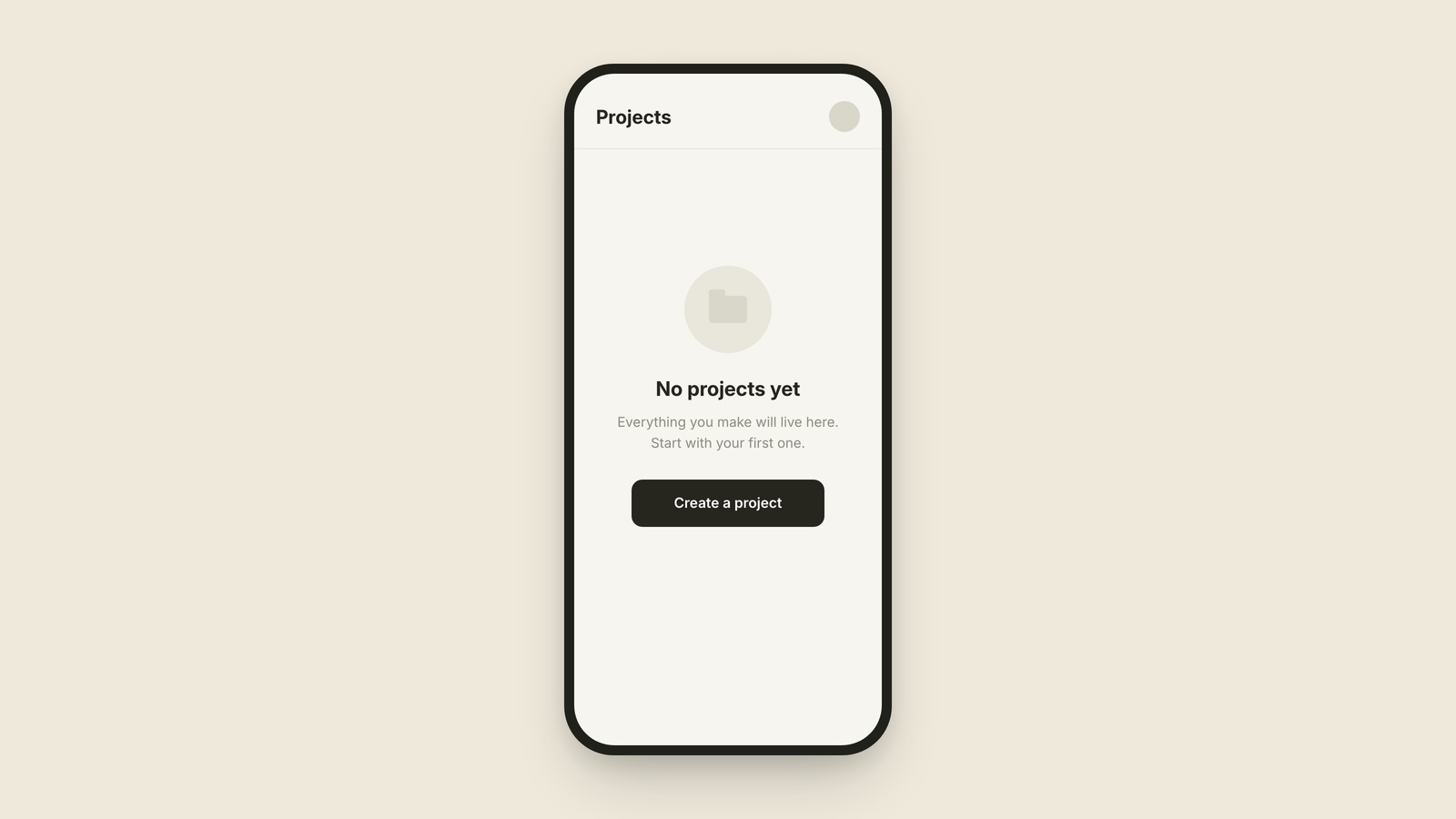
Empty State
What the screen says before there's anything to show.
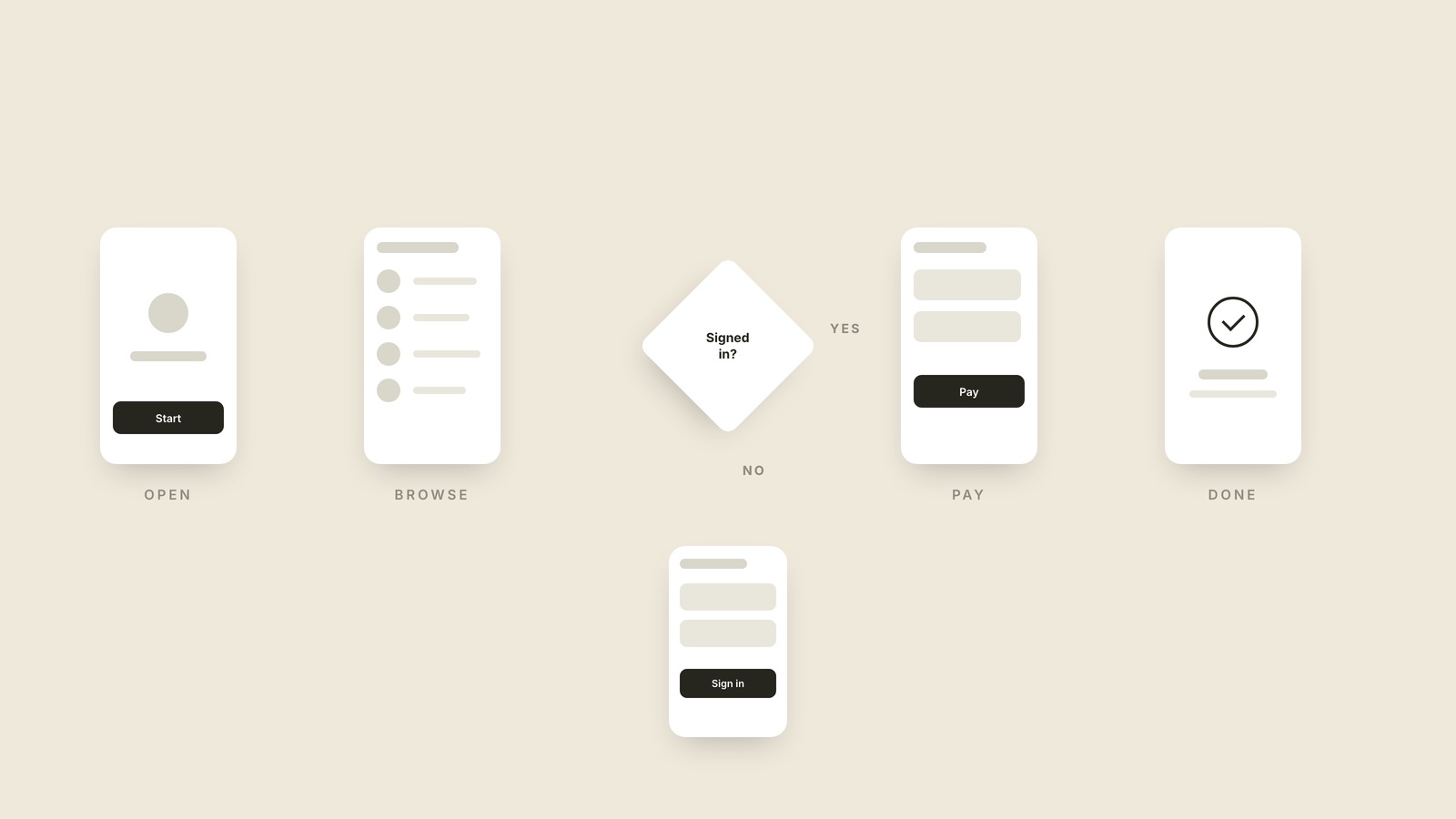
User Flow
A user flow is the step-by-step path a person takes through a product to finish one job, drawn as screens or boxes connected by arrows.
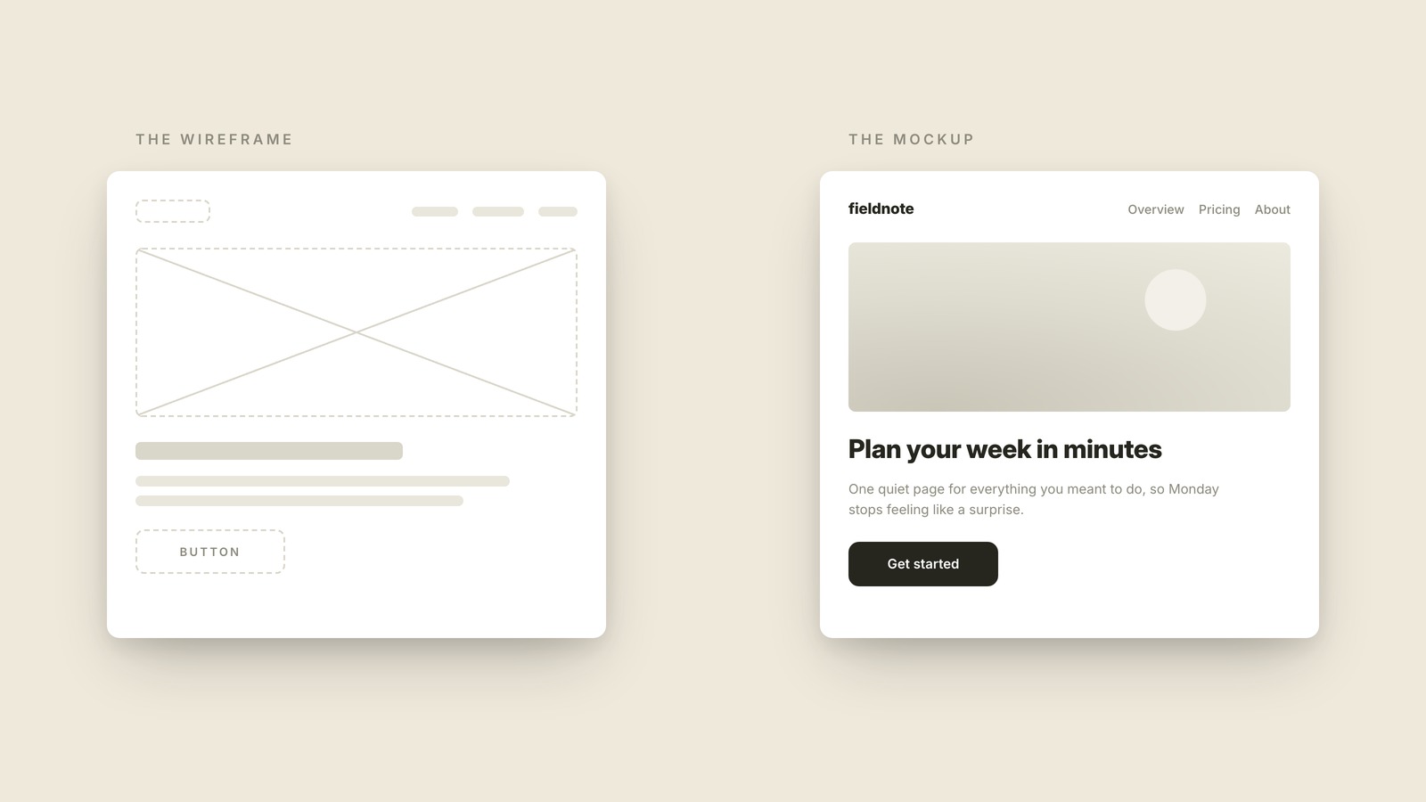
Mockup
A mockup is a full-color, realistic picture of a screen that looks finished but doesn't work yet.
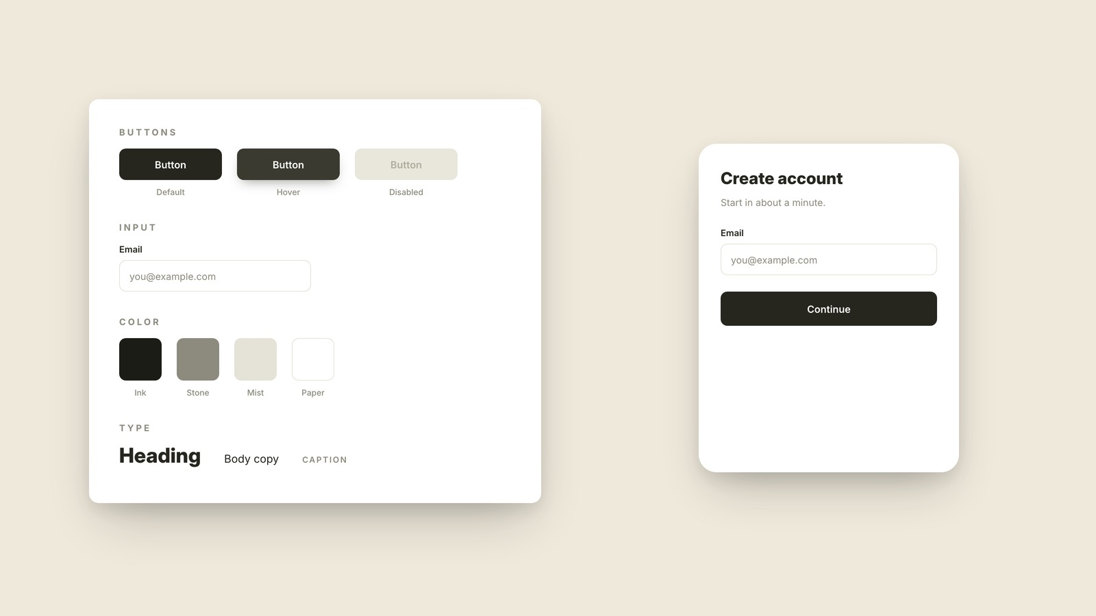
Design System
A design system is the shared kit of reusable components, colors, and rules a team draws from, so every screen looks like it came from the same product.
Affordance
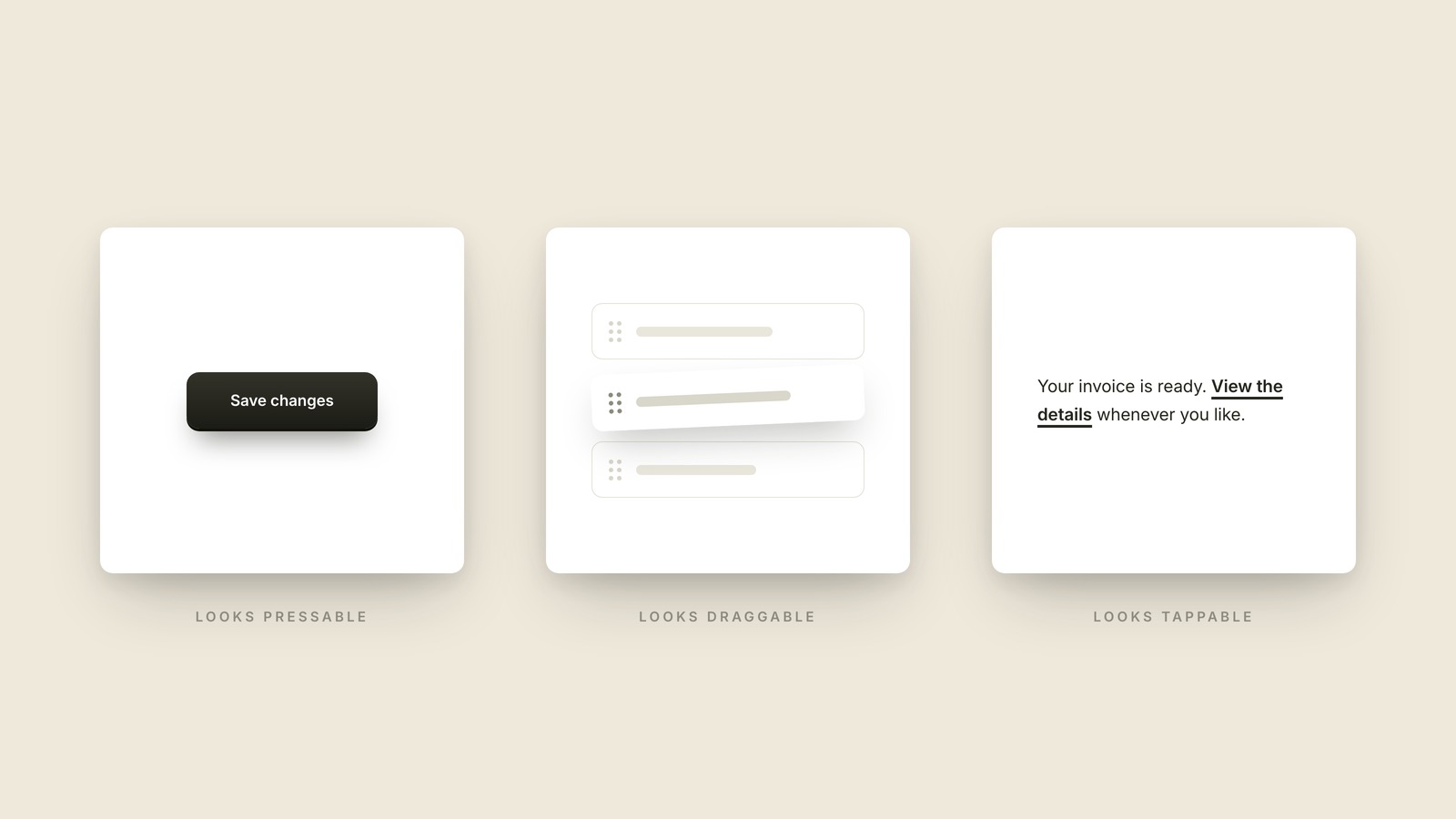
An affordance is the visual hint that tells you what you can do with something, the reason a button looks pressable before you've ever pressed it.
Onboarding
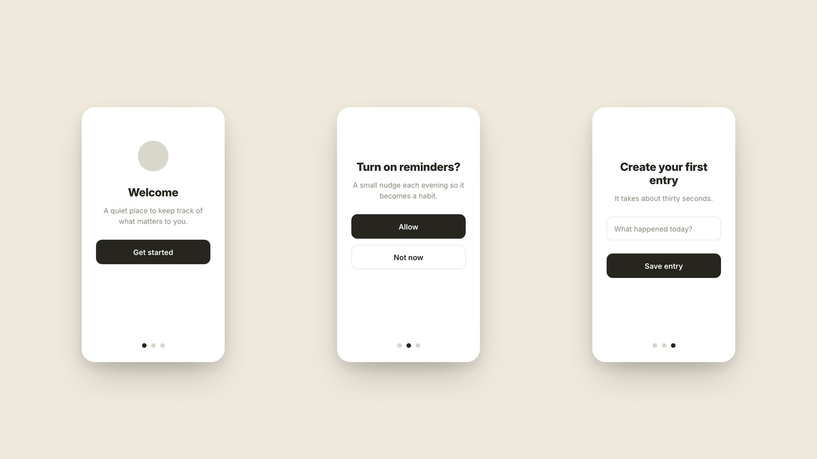
Onboarding is everything a product does to get a brand-new user from first open to first success.
Accessibility
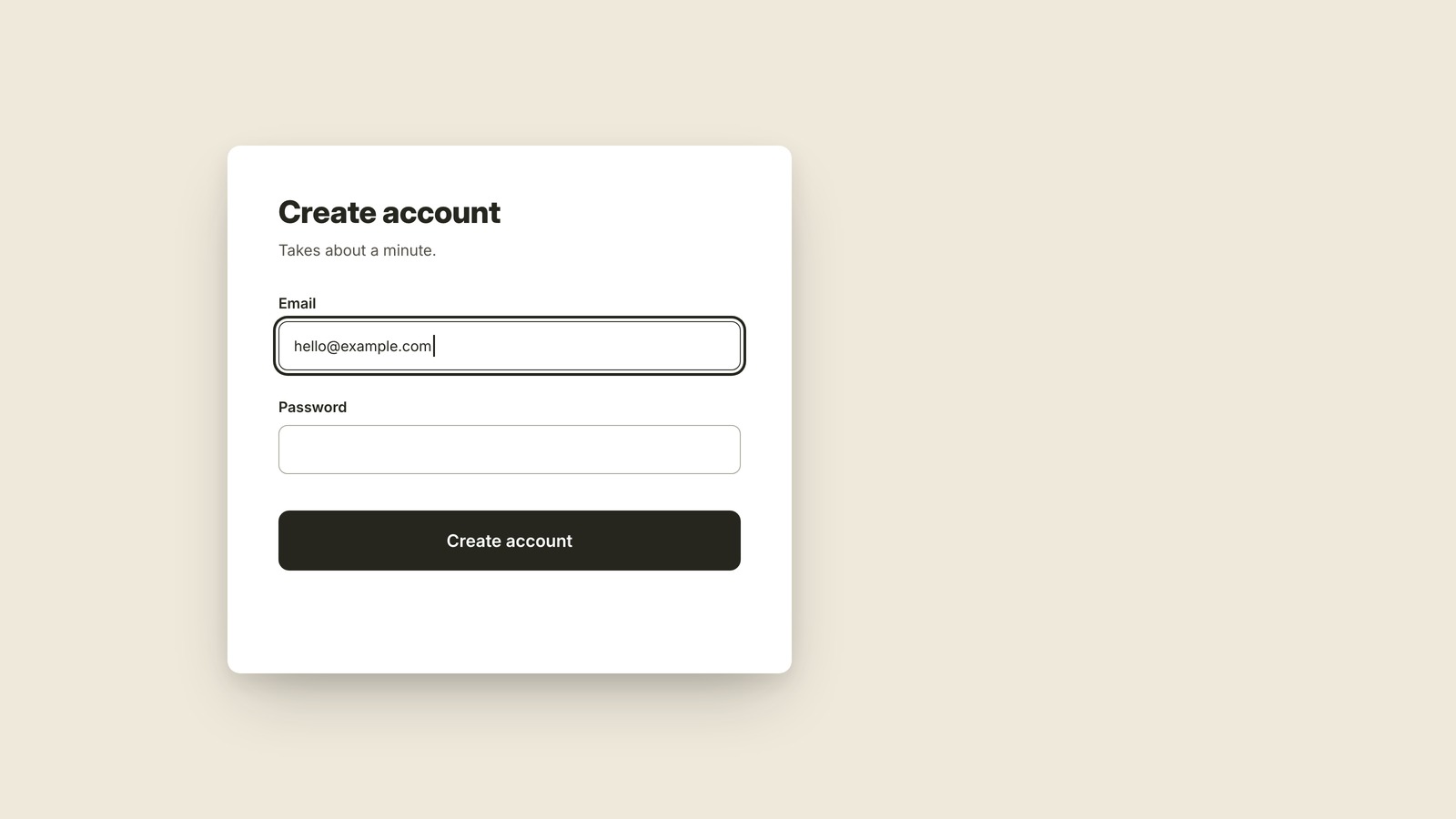
Accessibility is designing so that people with different vision, hearing, and motor abilities can use your product, which in practice makes it better for everyone.
Lorem Ipsum
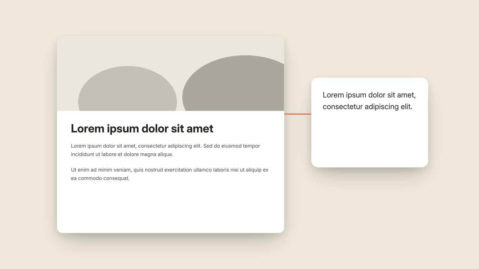
Meaningless text used to hold a layout.
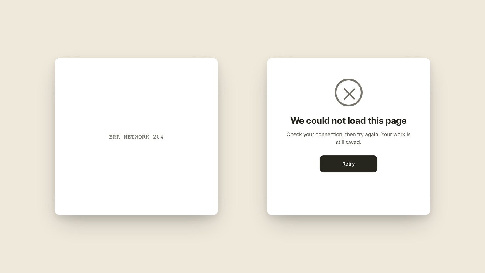
Error State
The designed way forward when something breaks.
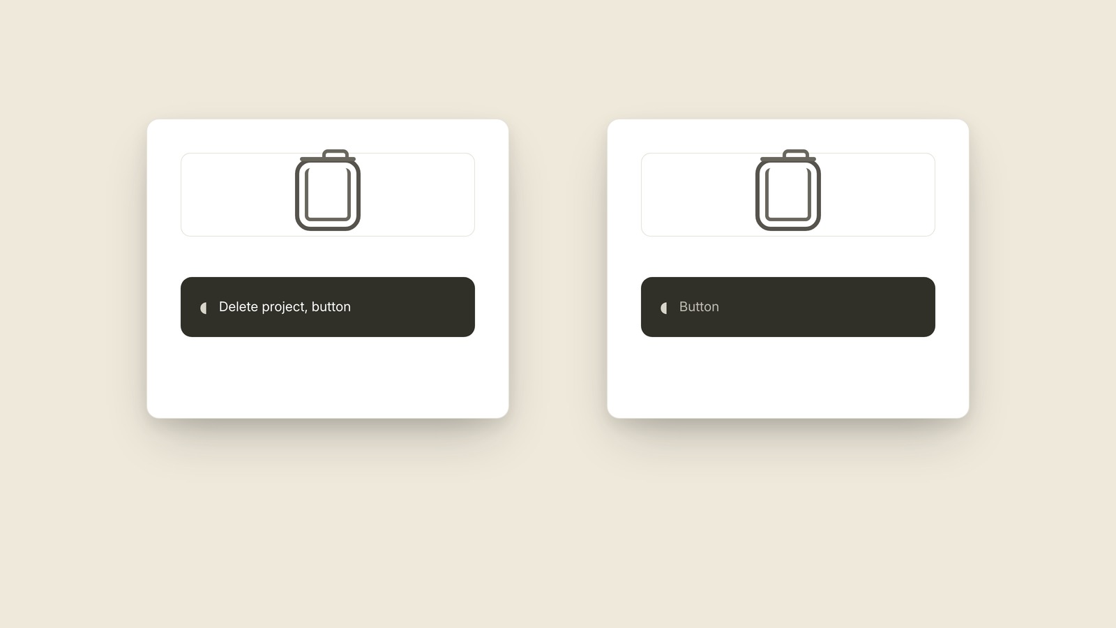
Screen Reader
Software that turns an interface into speech.
Browse by topic
66 terms across 4 topics. Pick a section.
Mobile UI Patterns 17 terms
Half Sheet The panel that slides up but doesn't take over. Toast A toast is the small message that appears briefly on screen to confirm something happened, then disappears on its own without you touching anything. Tab Bar A tab bar is the row of icons along the bottom of an app that switches between its main sections. Pull to Refresh Pull to refresh is the gesture where you drag a list downward past its top and let go to reload it. Action Sheet An action sheet is the menu that slides up from the bottom of the screen listing the things you can do to whatever you just tapped: Share, Duplicate, Delete. Floating Action Button A floating action button is the round button hovering in the bottom corner of an app screen, sitting on top of everything, that does the screen's single most important thing. Toggle A toggle is the little switch that flips a setting on or off the moment you tap it, and it never asks you to save. Skeleton Screen A skeleton screen is the set of gray placeholder shapes an app shows in the exact layout of the real content while it loads. Picker The rolling wheel that replaces the keyboard. Splash Screen The brief logo moment before the app is ready. Push Notification The message an app sends when you are not in it. Permission Prompt The system-owned box asking for private access. Text Scaling What happens when the reader turns the words up. Tap Target The full finger-sized area behind a control. Thumb Zone The part of a phone one hand can reach comfortably. Paywall The screen explaining what paid access costs. Spinner & Progress Bar Two loading signals for two kinds of wait.Web UI Patterns 23 terms
Modal The box that stops everything until you deal with it. Breadcrumb A breadcrumb is the trail of links near the top of a page that shows where you are in a site, like Home, then Shoes, then Sneakers. Hero The hero is the big section at the top of a page that carries the headline, the main image, and the one button the page most wants you to press. Hamburger Menu A hamburger menu is the icon made of three stacked lines, usually in a top corner, that opens the navigation a site is hiding. Sticky Header A sticky header is the bar across the top of a site that stays pinned in place while the rest of the page scrolls underneath it. Dropdown A dropdown is the control that shows only your current choice until you click it, then opens the list of other options. Accordion An accordion is a stack of collapsed sections that expand when you click them, most familiar as an FAQ where each answer unfolds beneath its question. Tooltip A tooltip is the tiny label that appears when you rest your cursor on something, tells you what it is, and disappears the moment you move away. Card A card is the rectangular container that groups an image, a title, and a few details into one self-contained, clickable unit, usually repeated in a grid of near-identical siblings. Call to Action (CTA) A call to action is the button or link that asks the visitor to take the one next step, like Start free trial or Book a demo. Above the Fold Above the fold is everything visible on a page before anyone scrolls, the only part every single visitor is guaranteed to see. Responsive Design Responsive design means building one site that rearranges itself to fit whatever screen it's on, instead of building separate sites for desktop and phone. Navigation Bar The top row that maps the whole site. Alt Text The image description software can read aloud. Radio Button & Checkbox Round for one choice, square for any number. Placeholder Text The form hint that disappears when typing starts. Inline Validation The form feedback that appears beside the problem. Truncation The three dots standing in for missing words. Ghost Button The outlined action that speaks more quietly. Pill / Chip / Tag Three names for the same rounded little label. Social Proof Other people's evidence doing the persuading. Pricing Table Plan cards built for side-by-side comparison. Open Graph Image The picture a shared link turns into.Visual Design Vocabulary 13 terms
Whitespace Whitespace is the empty space around and between the elements of a design, left there on purpose so everything has room to breathe. Kerning The space between two letters, tuned by eye. Hierarchy Hierarchy is making the important things look important, so your eye reads a screen in the order the designer intended. Contrast Contrast is the difference between an element and whatever sits behind it, and it decides whether text is effortless to read or nearly invisible. Grid A grid is the invisible set of columns a layout is built on, so everything lines up on purpose instead of by luck. Padding & Margin Padding is the space inside a box's edge, between the border and the content; margin is the space outside the box, pushing its neighbors away. Serif & Sans Serif Serifs are the small feet at the ends of a letter's strokes: typefaces that have them are serif, and typefaces without them are sans serif, sans being French for without. Leading The vertical space from one line of text to the next. Color Palette A color palette is the small set of colors a product commits to, chosen once and reused everywhere, so every screen looks related instead of random. Dark Mode Dark mode is the version of an interface drawn in light text on dark backgrounds, designed as a complete second color scheme rather than the light version with its colors flipped. Vector & Raster A vector image is stored as math, so it stays perfectly crisp at any size; a raster image is stored as a fixed grid of pixels, so it goes blurry and blocky the moment you enlarge it. Px vs Em Fixed sizes compared with sizes that can grow. Color Blindness Why color cannot carry meaning alone.UX & Process 13 terms
Wireframe A wireframe is a deliberately rough sketch of a screen, made of gray boxes and placeholder lines, that settles what goes where before anyone argues about colors. Prototype A prototype is a clickable fake of a product, real enough to tap through and test, built before the actual product exists. Dark Pattern A dark pattern is a design trick that steers you into something you didn't mean to choose, like a cancel page where the button to stay is huge and the way out is buried in fine print. Empty State What the screen says before there's anything to show. User Flow A user flow is the step-by-step path a person takes through a product to finish one job, drawn as screens or boxes connected by arrows. Mockup A mockup is a full-color, realistic picture of a screen that looks finished but doesn't work yet. Design System A design system is the shared kit of reusable components, colors, and rules a team draws from, so every screen looks like it came from the same product. Affordance An affordance is the visual hint that tells you what you can do with something, the reason a button looks pressable before you've ever pressed it. Onboarding Onboarding is everything a product does to get a brand-new user from first open to first success. Accessibility Accessibility is designing so that people with different vision, hearing, and motor abilities can use your product, which in practice makes it better for everyone. Lorem Ipsum Meaningless text used to hold a layout. Error State The designed way forward when something breaks. Screen Reader Software that turns an interface into speech.Fig. 01 / Half Sheet · In motion
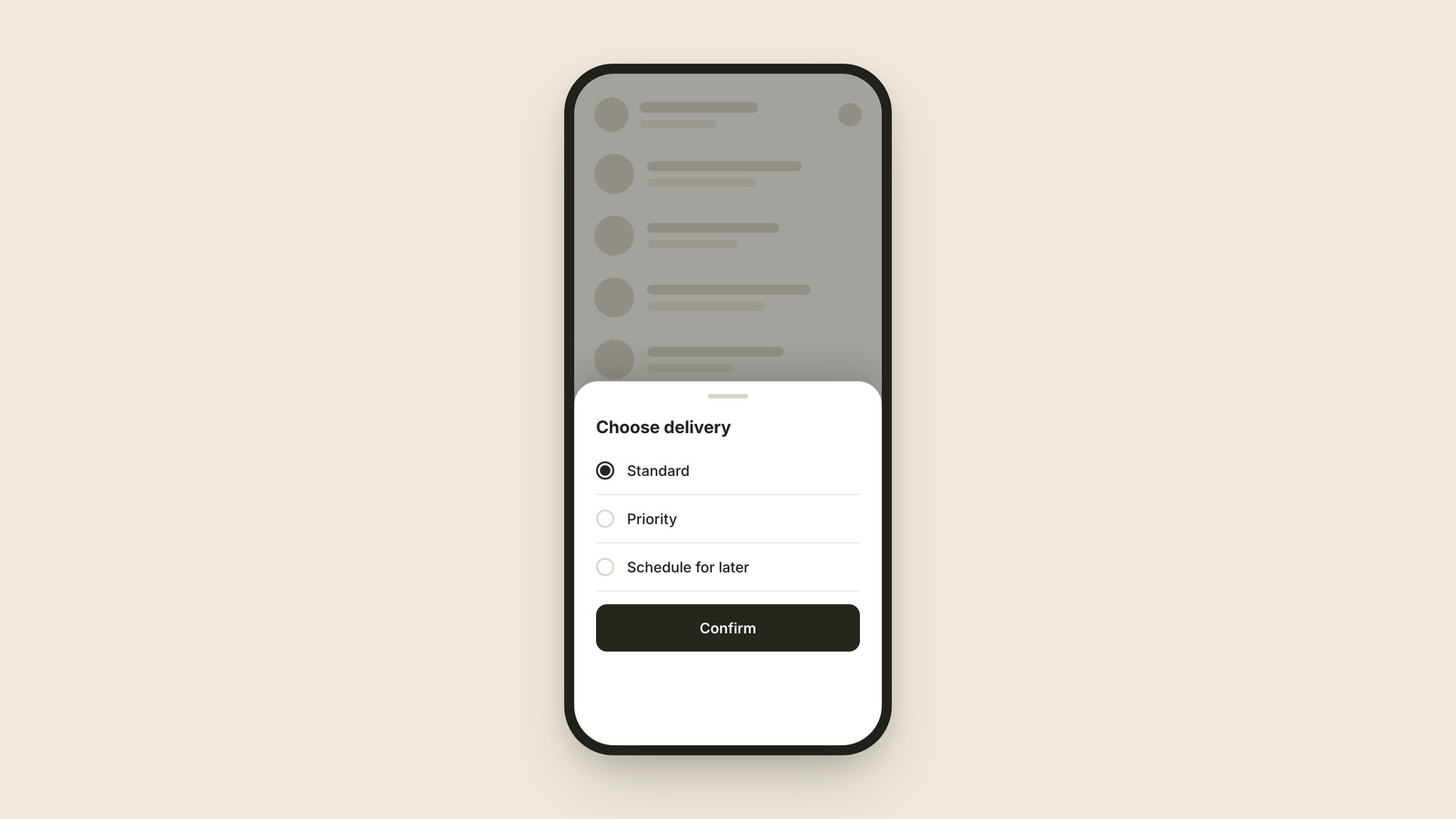
Half Sheet
EXPLAINED SIMPLY:The panel that slides up but doesn't take over.
A half sheet is the panel that slides up from the bottom of your phone screen and stops partway, so the screen behind it stays visible. Apple Maps does it, the share menu does it, Uber does it when you pick a ride.
The point of a half sheet is that you never really leave. The page behind it dims but stays put, and one swipe down puts everything back the way it was. It exists for quick decisions that borrow the screen instead of taking it over: pick an option, adjust a setting, confirm a thing.
You'll also hear "bottom sheet," which is the Android and design-system name for the same family. Some sheets stop at fixed heights (those stopping points are called detents), and the pill-shaped handle at the top is the grabber, the visual hint that you can drag it.
If it slides up and covers everything with no view of the screen behind it, that's not a half sheet anymore. That's a full-screen modal wearing a sheet costume.
When you want "let me choose something without losing my place," ask for a half sheet.