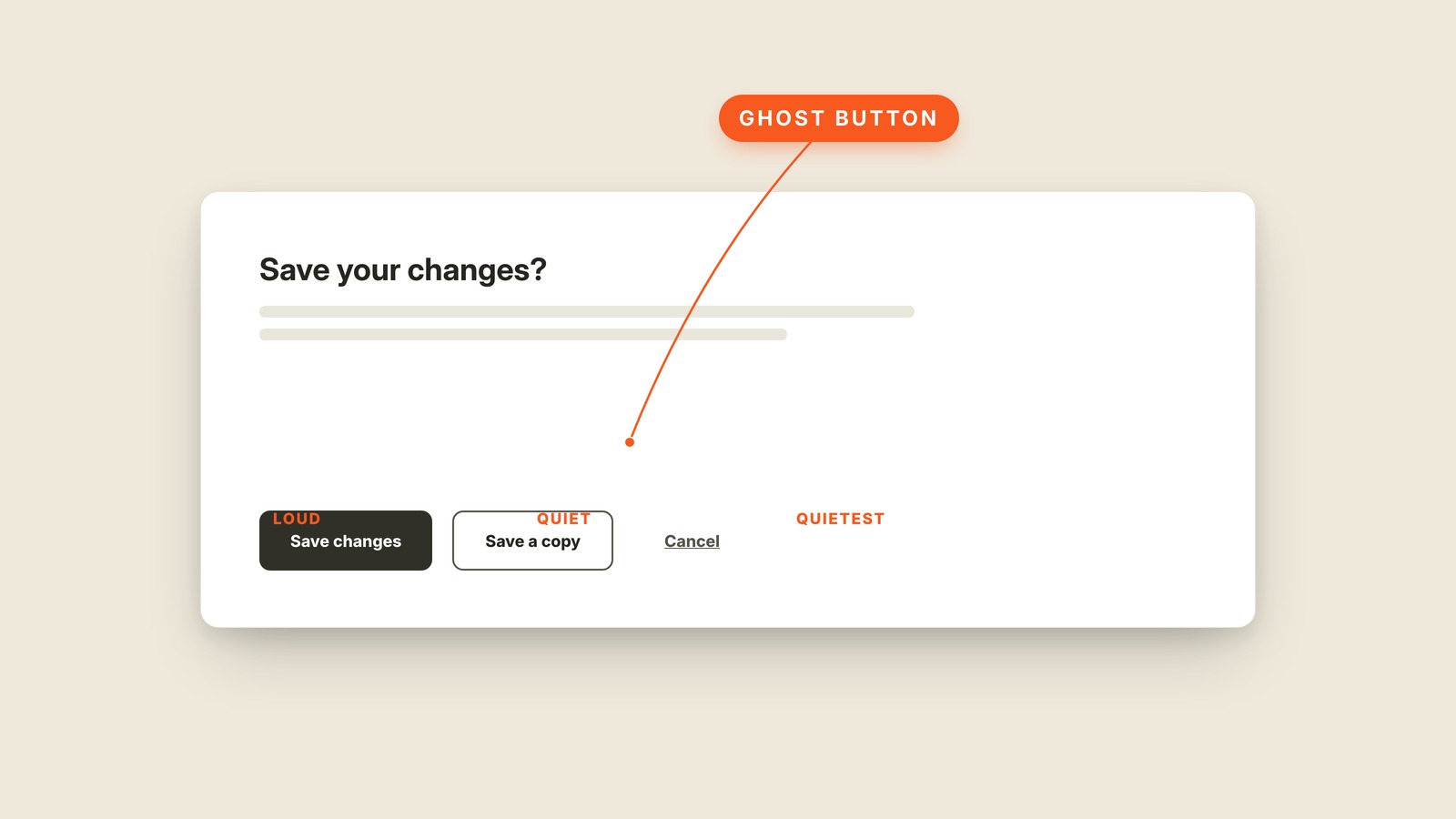
Fig. 36 / Ghost Button
Web UI Patterns
Ghost Button
EXPLAINED SIMPLY:The outlined action that speaks more quietly.
A ghost button is the quiet outlined button with no solid fill, usually placed beside a stronger filled action.
Button styles create a pecking order. The filled button speaks first, the outlined ghost button offers a secondary path, and a bare text action whispers from the edge. The ghost button is useful because it looks pressable without competing for first place.
Put Save and Cancel side by side with equal weight and the user has to stop and read. Make Save solid and Cancel outlined, and the intended path is visible before the words are. That hierarchy should follow consequence, not whoever argued hardest in the review.
You'll hear outline button, outlined button, secondary button, tertiary button, and button hierarchy. The names vary between design systems, so the visual relationship matters more than whether one team calls its quietest style secondary and another calls it tertiary.
A ghost button still needs a visible border, readable text, and a real hover state. Pale gray lines on white disappear when the button tries too hard to be subtle. If two actions look equally loud, the hierarchy has not made a choice.