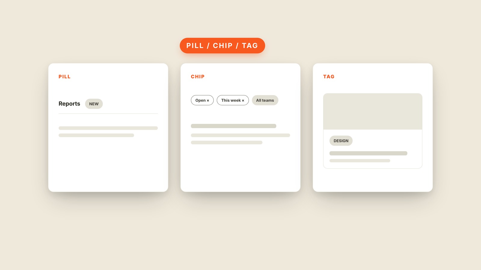
Fig. 37 / Pill / Chip / Tag
Web UI Patterns
Pill / Chip / Tag
EXPLAINED SIMPLY:Three names for the same rounded little label.
Pills, chips, and tags are small rounded labels attached to content, three overlapping names for the same lozenge-shaped piece of interface.
The name usually follows the job. A New pill draws attention beside a menu item. A filter chip shows an active choice and may carry an x to remove it. A tag names a topic on an article. The shape stays nearly identical while the behavior changes around it.
That behavior is how you tell it from a badge. A badge usually counts something waiting, such as three unread messages. A chip names a state or choice, such as Shipped or Vegetarian. A segmented control may look like connected pills, but selecting one changes the view.
You'll also hear lozenge, token, filter chip, and status badge. Product teams disagree about the exact borders between these words, so correcting someone rarely helps. Ask whether the thing is only a label, can be selected, or can be removed.
Rounded corners do not make every short label a chip. The role matters more than the silhouette. If tapping it changes something, the selected and unselected states need to be obvious.