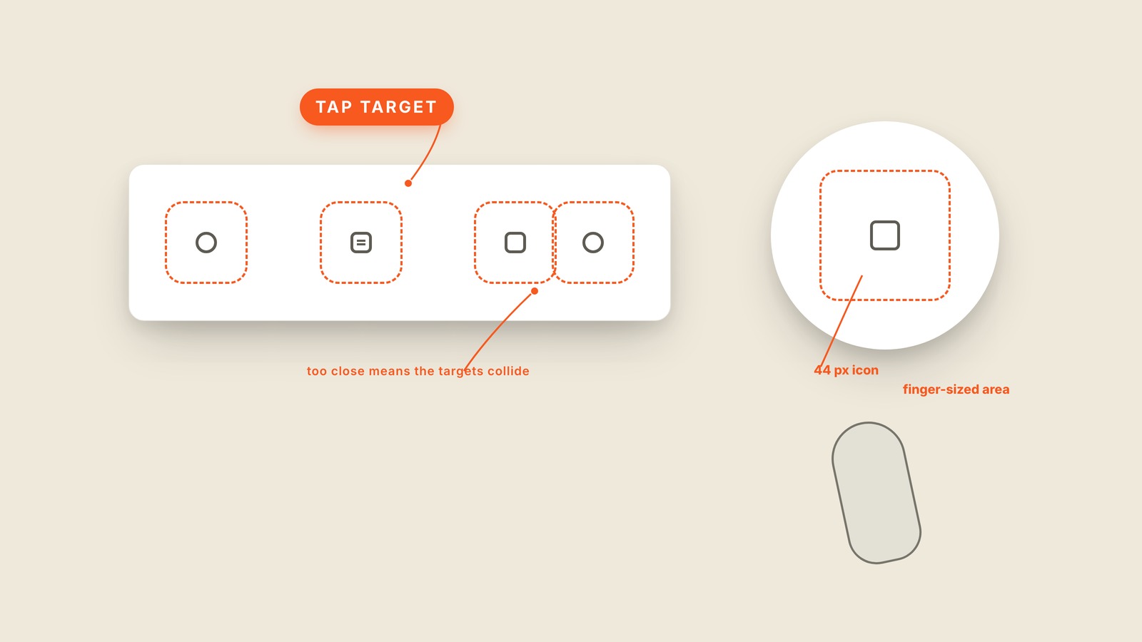
Fig. 14 / Tap Target
Mobile UI Patterns
Tap Target
EXPLAINED SIMPLY:The full finger-sized area behind a control.
A tap target is the full touchable area of a button or link, which is often larger than the icon or words you can see.
A fingertip is blunt compared with a mouse pointer. A tiny icon can look elegant and still be frustrating if the invisible area around it is just as tiny. The visible button tells you where to aim, but the tap target decides whether you hit it.
Good interfaces add breathing room around small icons so the target reaches a comfortable finger-sized square. They also leave enough distance between neighboring targets that a near miss does not trigger the wrong action. That is why two perfectly readable icons can still be a bad control if their touch areas overlap.
You'll also hear touch target, hit area, hitbox, tap area, and the less polite "fat finger" problem. A stepper makes the risk obvious: the minus and plus may look separate, but cramped targets turn changing a quantity into a guessing game.
A larger tap target does not require a larger-looking icon. The invisible area can grow while the artwork stays exactly where it is. If people keep tapping twice, check the target before blaming their fingers.