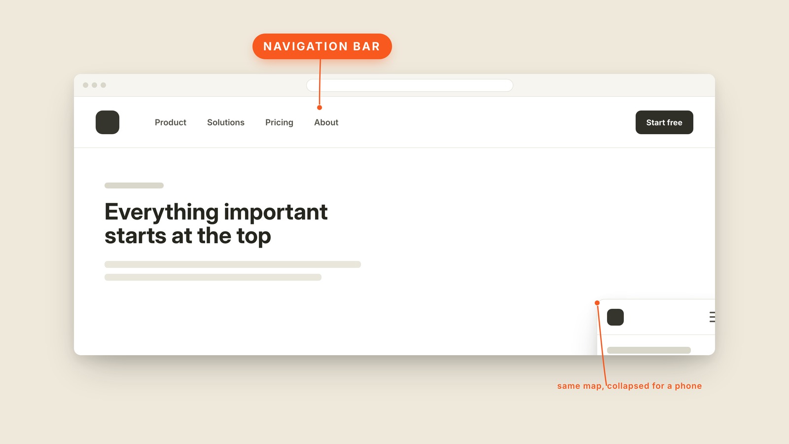
Fig. 30 / Navigation Bar
Web UI Patterns
Navigation Bar
EXPLAINED SIMPLY:The top row that maps the whole site.
A navigation bar is the strip across the top of a website that holds the logo, the main links, and usually one important button.
It answers two questions before anyone reads the page: where am I, and where else can I go? The logo usually returns home, the links name the main sections, and the strongest action sits at the far edge. A good navigation bar makes the shape of the whole site understandable from one row.
On a phone, there is rarely room for that row. The logo stays, the links fold behind a hamburger menu, and the main action either survives or moves into the opened panel. Responsive design changes the arrangement, but the destinations should remain familiar.
You'll hear navbar, nav, top nav, site header, main nav, menu bar, and navigation menu. A sticky header is a navigation bar with one extra behavior: it remains pinned while the page scrolls. A mega menu is what happens when one link opens a whole organized panel.
The bar should carry the few links almost everyone needs, not the full sitemap. Everything else can find a quieter home in the footer. If every page gets a place in the top row, the navigation stops helping anyone choose.