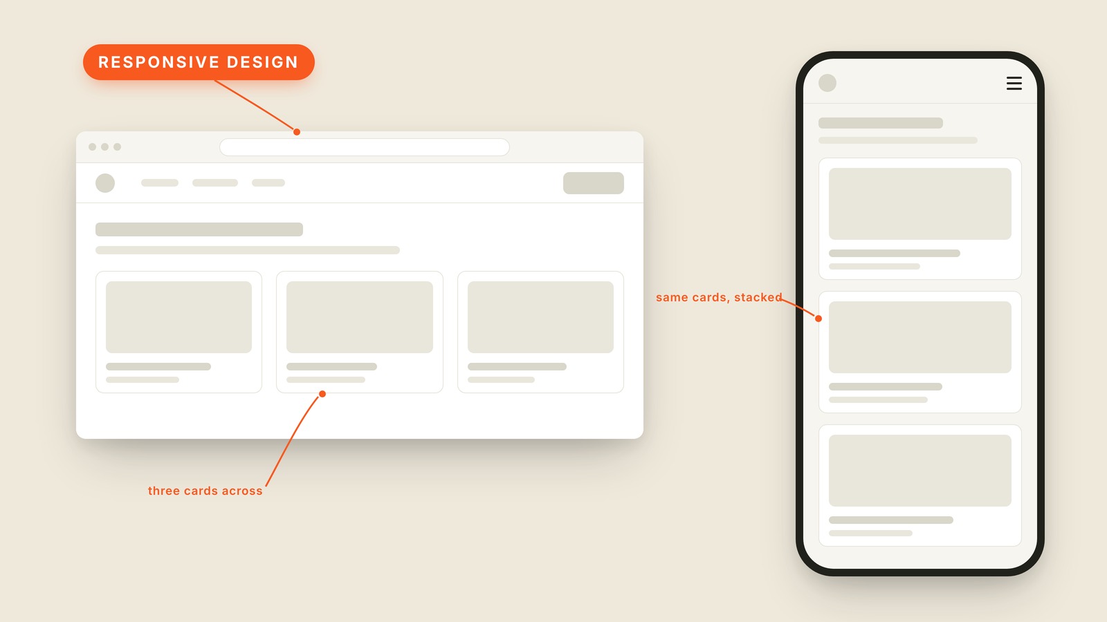
Fig. 29 / Responsive Design
Web UI Patterns
Responsive Design
EXPLAINED SIMPLY:Responsive design means building one site that rearranges itself to fit whatever screen it's on, instead of building separate sites for desktop and phone.
Responsive design means building one site that rearranges itself to fit whatever screen it's on, instead of building separate sites for desktop and phone.
We used to do it the other way. For years companies ran a second site at m.company.com, a stripped-down mobile twin that was always slightly out of date. Responsive design retired that: one site, one set of content, a layout that adapts.
The picture shows the move. On the desktop, three cards sit in a row; on the phone, the same cards stack into a single column and the menu collapses into a hamburger menu. Nothing was removed for the small screen; everything was rearranged.
The width where a layout snaps into a new arrangement is called a breakpoint. A layout might reflow once around tablet width and again around phone width. You don't need the numbers, but the word is useful, because the awkward in-between widths are where responsive layouts quietly fall apart. Tablet width is the middle child; ask to see it sometime.
You'll also hear "responsive," "mobile friendly," and "mobile-first," which means designing the phone version before the desktop one because it's easier to expand a small layout than to squeeze a big one. "Adaptive design" is technically a stricter cousin (a few fixed layouts instead of one fluid one), but people use the words interchangeably.
When a designer shows you desktop only, ask what happens on a phone. If the answer involves stacked cards and a hamburger, it's been thought through. If the answer is a pause, it hasn't.