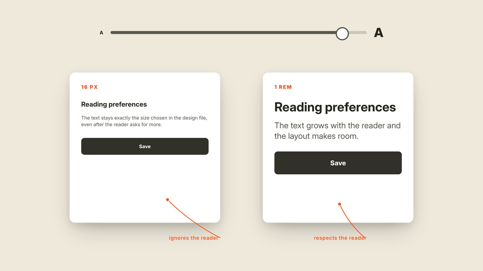
Fig. 52 / Px vs Em
Visual Design Vocabulary
Px vs Em
EXPLAINED SIMPLY:Fixed sizes compared with sizes that can grow.
Px and em are two ways to size things on a screen: a px value stays fixed at the number chosen, while em and rem values are relative and can grow with the reader's text settings.
Set body text to 16px and it asks for 16 screen pixels. Set it to 1rem and it asks for one share of the reader's base text size. At the default setting those may look identical. Turn text scaling up and the difference appears. The fixed value obeys the design file; the relative value obeys the reader.
Em scales from the size of its surrounding element. Rem scales from the page's root size, which makes it easier to reason about across a whole site. You do not need to write the CSS to understand the design consequence: one unit adapts and one may stay stubbornly small.
You'll hear pixels, relative units, fixed units, rem, and em. Px is not automatically wrong, and interfaces still use it for hairline borders, icons, and exact artwork. The danger is freezing text and spacing that people may need to enlarge.
A layout that uses relative units has room to respond instead of merely zoom. Pair them with a flexible layout and the words can grow without colliding. If turning up text size changes nothing, fixed units are the first suspect.