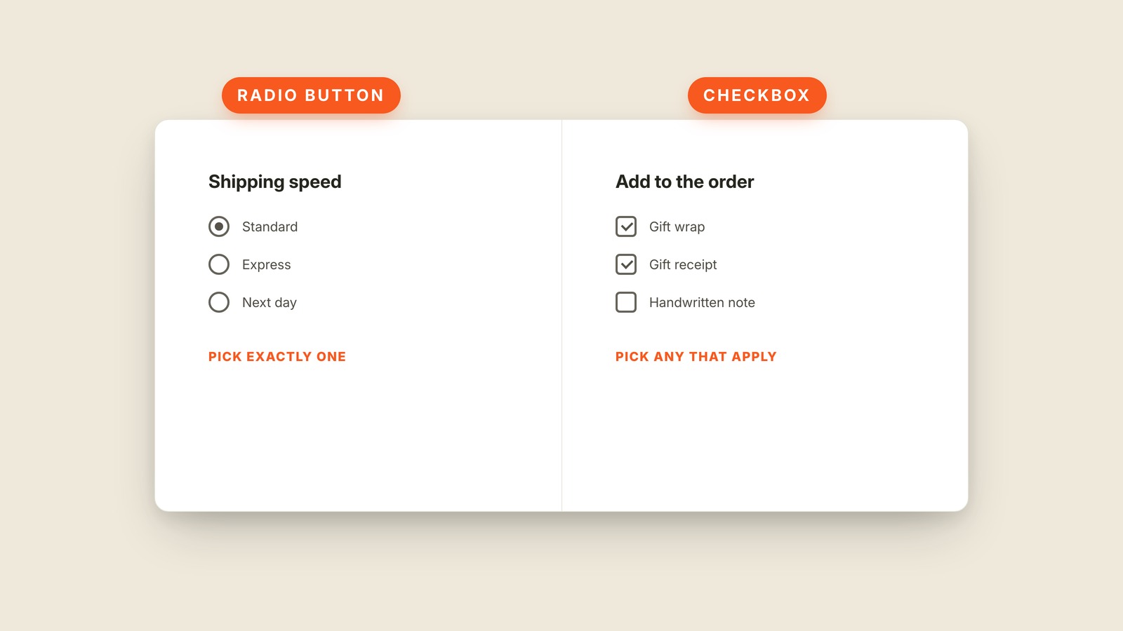
Fig. 32 / Radio Button & Checkbox
Web UI Patterns
Radio Button & Checkbox
EXPLAINED SIMPLY:Round for one choice, square for any number.
Radio buttons are the round controls used when exactly one option may win; checkboxes are the square controls used when any number of options may be chosen.
The shapes are a promise. Pick Express shipping and Standard turns off, because a package cannot take both routes. Check Gift wrap and Gift receipt can remain checked together, because those choices do not compete. Circles mean one from the group; squares mean any that apply.
The name radio button comes from old car radios, where pressing one station button popped the previous one back out. The hardware is gone, but the exactly-one behavior survived. A checkbox behaves more like a paper checklist: each mark stands on its own.
A toggle handles another kind of choice. It changes one setting immediately, while a checkbox usually joins other answers and waits for the form to be submitted. A dropdown can also choose one item, but it hides the available options until opened.
Do not use checkboxes when choosing one should cancel the others. The interface will allow an impossible answer or spend extra code pretending squares are circles. Choose the control whose built-in behavior already matches the decision.