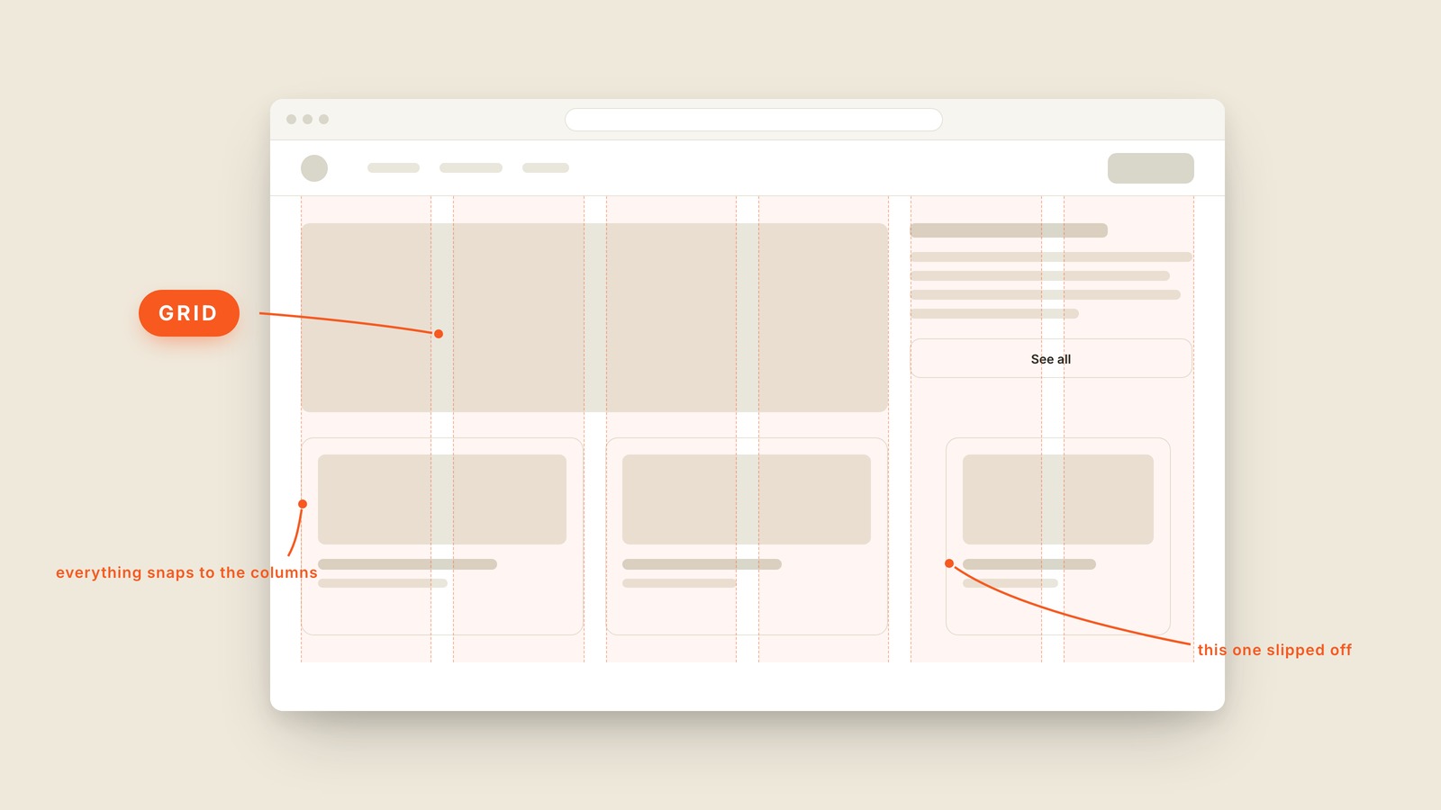
Fig. 45 / Grid
Visual Design Vocabulary
Grid
EXPLAINED SIMPLY:A grid is the invisible set of columns a layout is built on, so everything lines up on purpose instead of by luck.
A grid is the invisible set of columns a layout is built on, so everything lines up on purpose instead of by luck. You never see it on a finished page, but nearly every tidy website you've used has one underneath.
Switch the overlay on and the page confesses. In the picture, the columns appear as translucent stripes and the layout visibly obeys them: the big feature block spans its columns and the cards underneath snap to the same edges. Over in the sidebar, one card has slipped off its column, and you probably spotted it before you could say why. Your eye catches a broken grid long before your brain does, and that tiny wrongness is what "something feels off" usually means.
Most layouts run on twelve columns, because twelve divides cleanly into halves, thirds, and quarters. Elements span whole columns, the gaps between them, called gutters, stay constant, and a page holding forty things reads as orderly instead of scattered. The grid does for a layout what lined paper does for handwriting.
It also answers the phone question. Responsive design is mostly one grid collapsing gracefully: twelve columns on a desktop become four on a phone, and every block reflows to the new count. Teams that agree on a grid stop having alignment arguments, because "where should this go" turns into "how many columns does it span," which has an answer.
You'll also hear layout grid or column grid, and the twelve-column grid by name. The baseline grid is the vertical cousin, invisible rows that keep lines of text marching evenly. When a layout feels scattered, ask what grid it's on. If the answer is a shrug, you've found the problem.